︎
︎Client – Heal’s
︎Role – Brochure Design / Graphic Design / Website Design / Press advertising
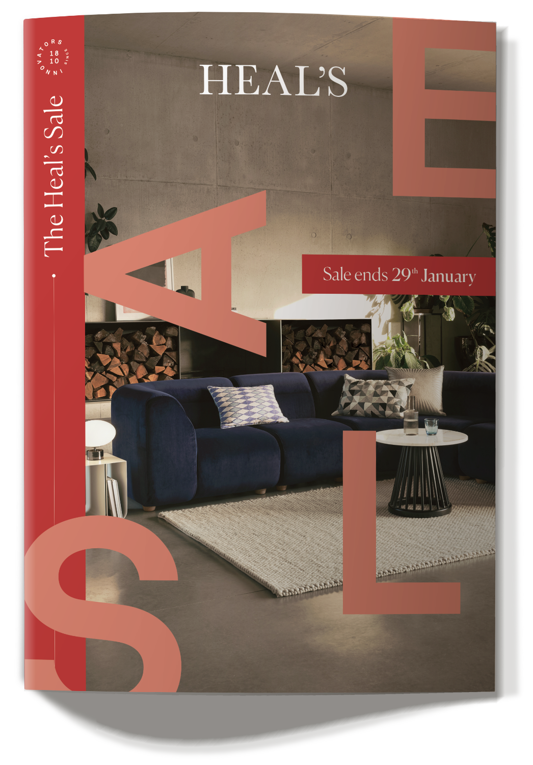
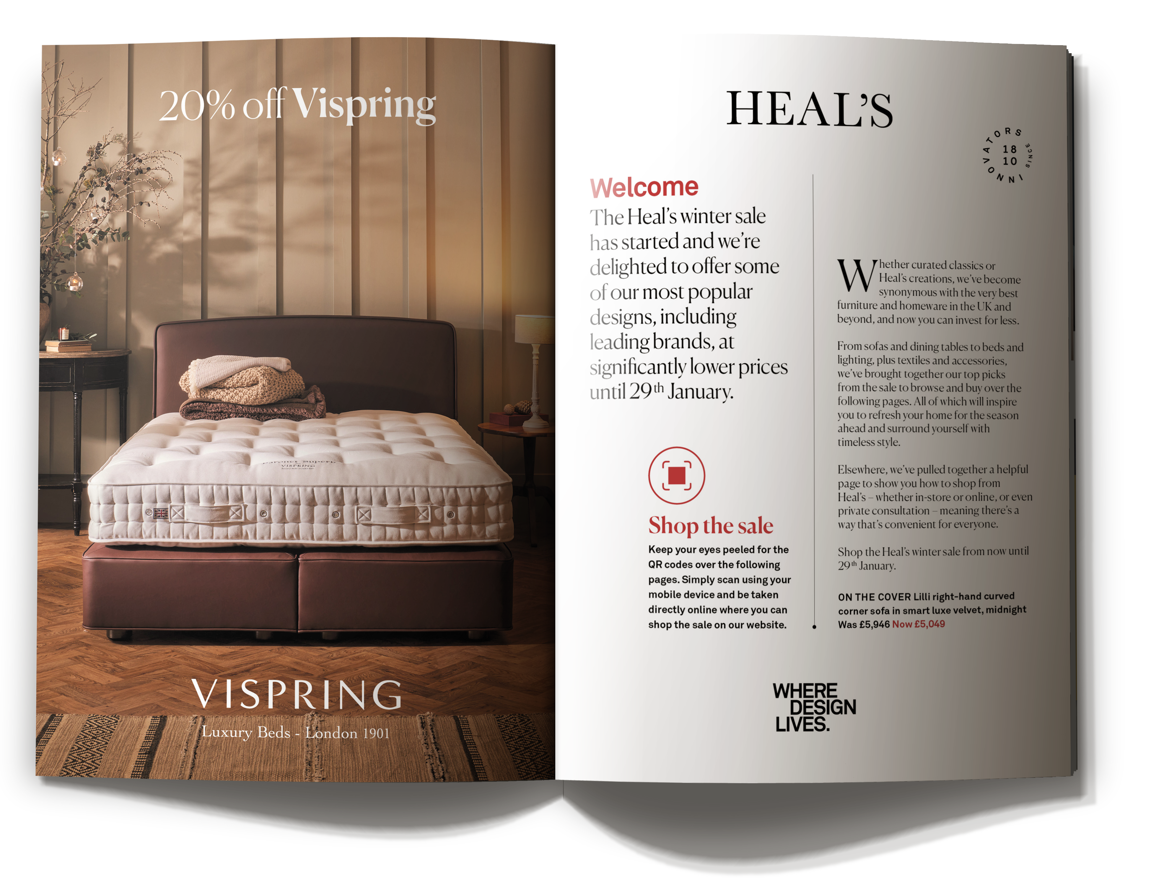
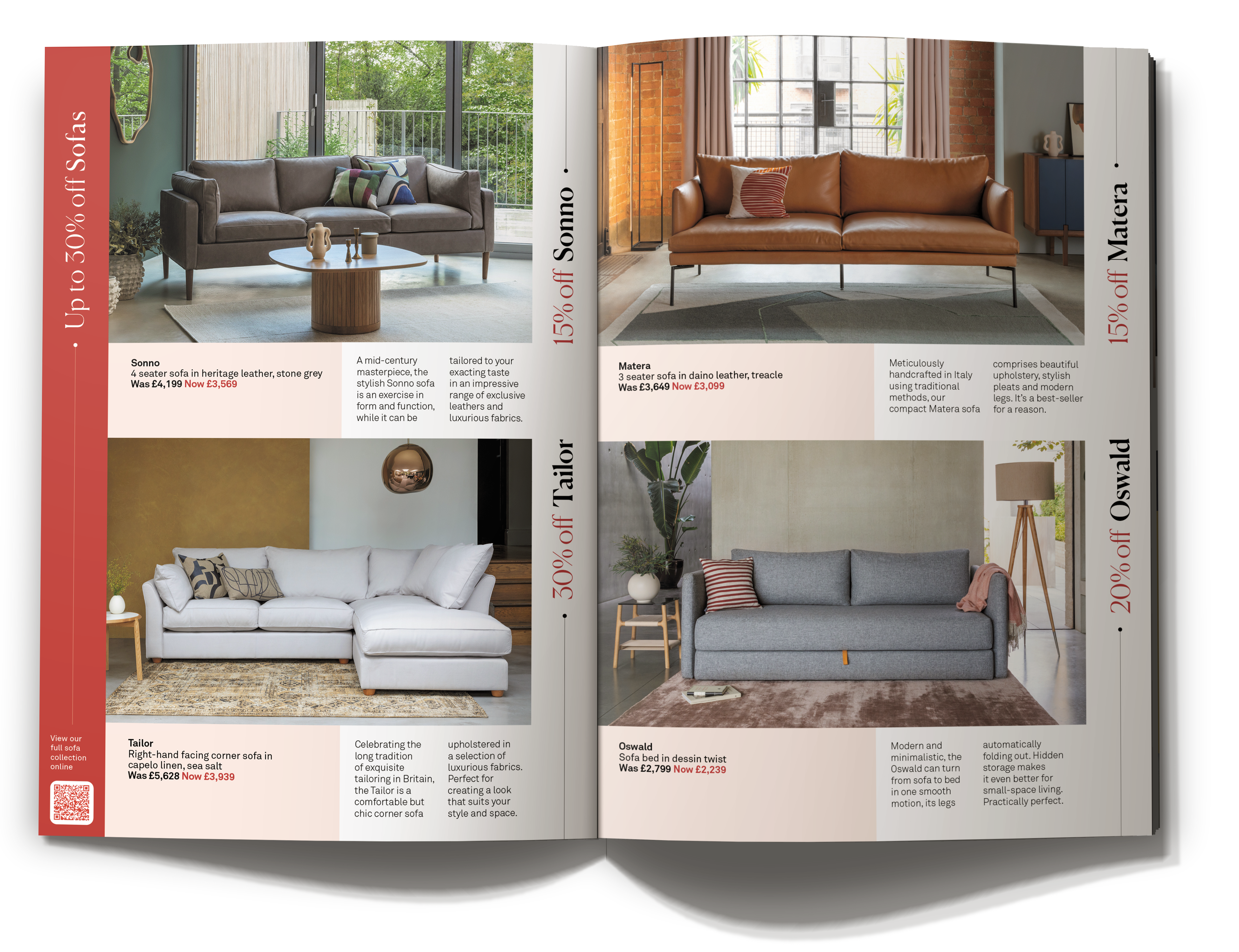
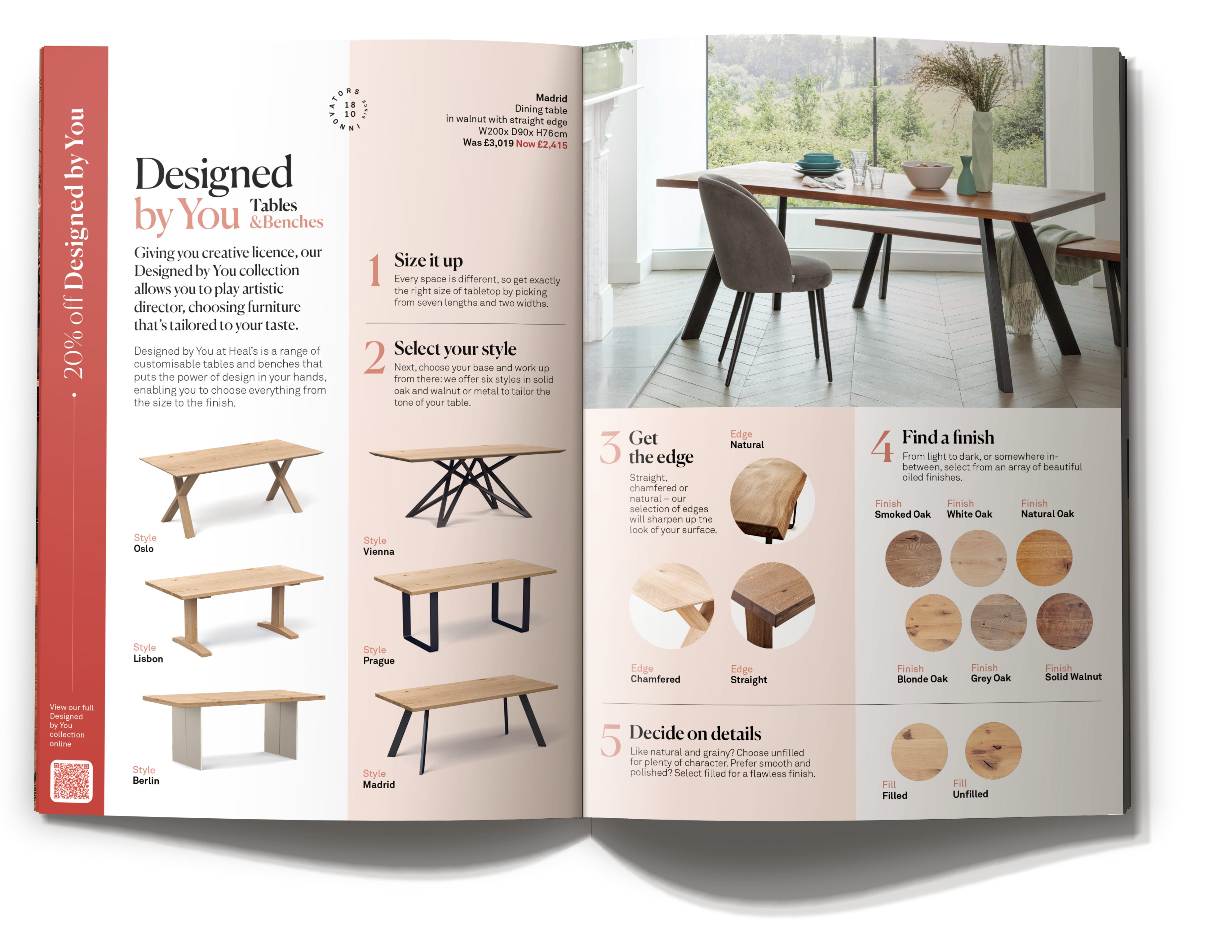
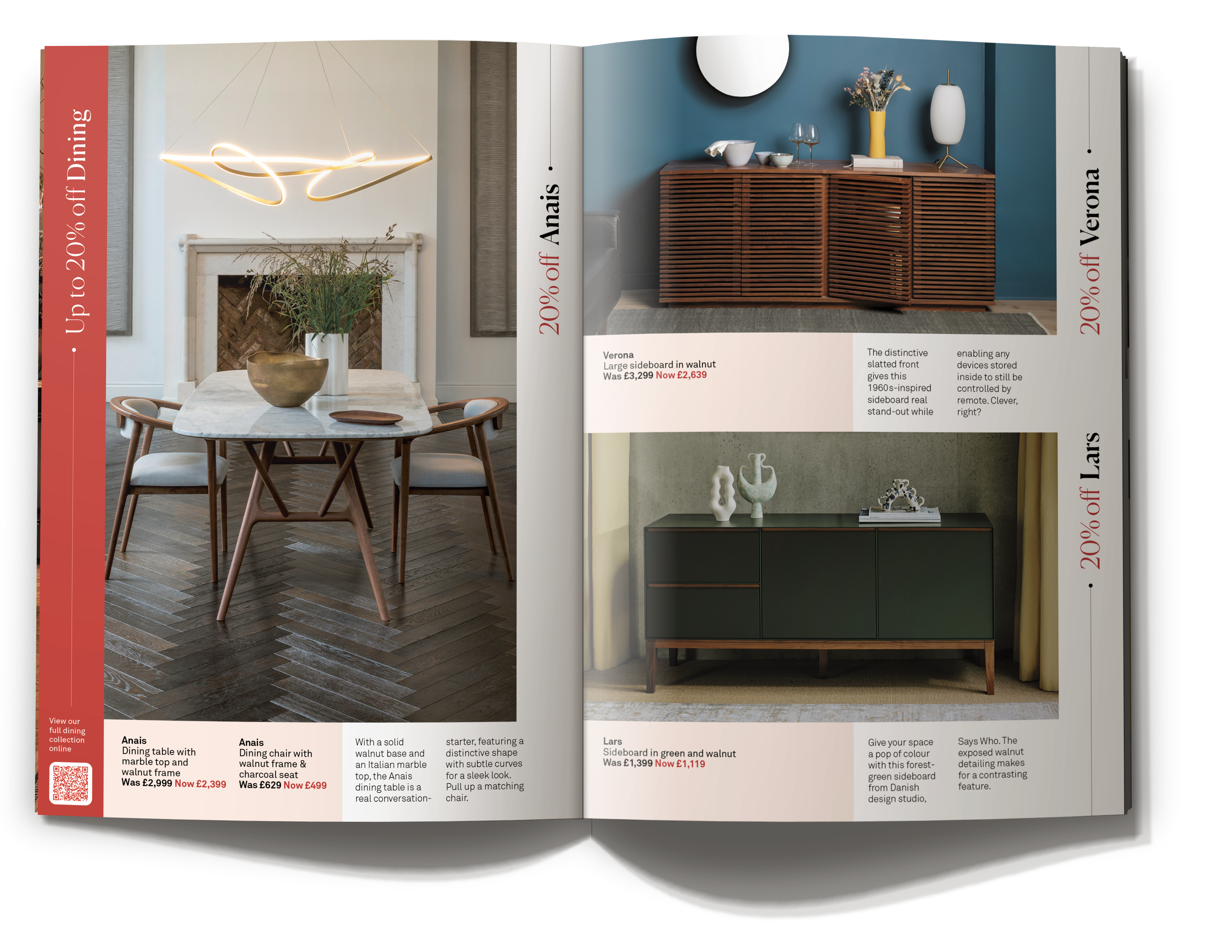
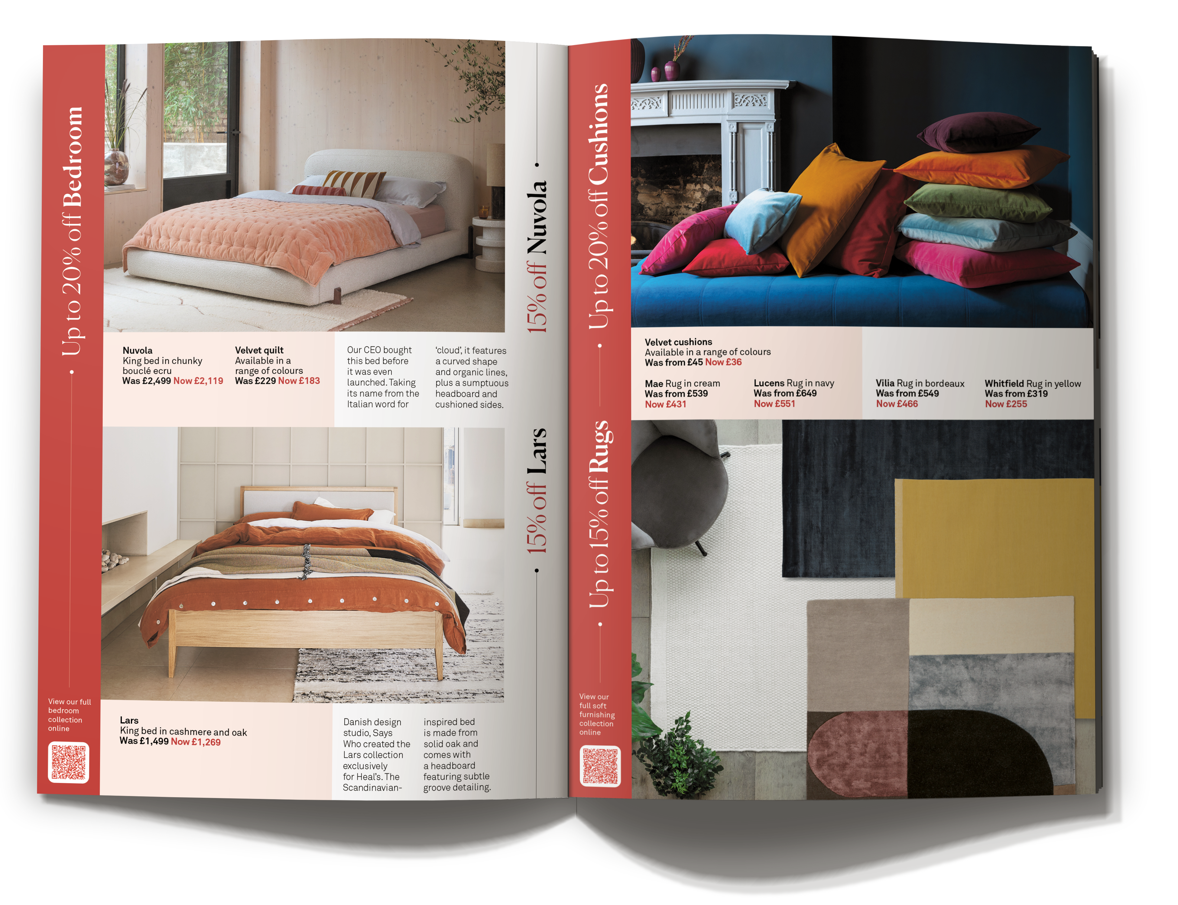
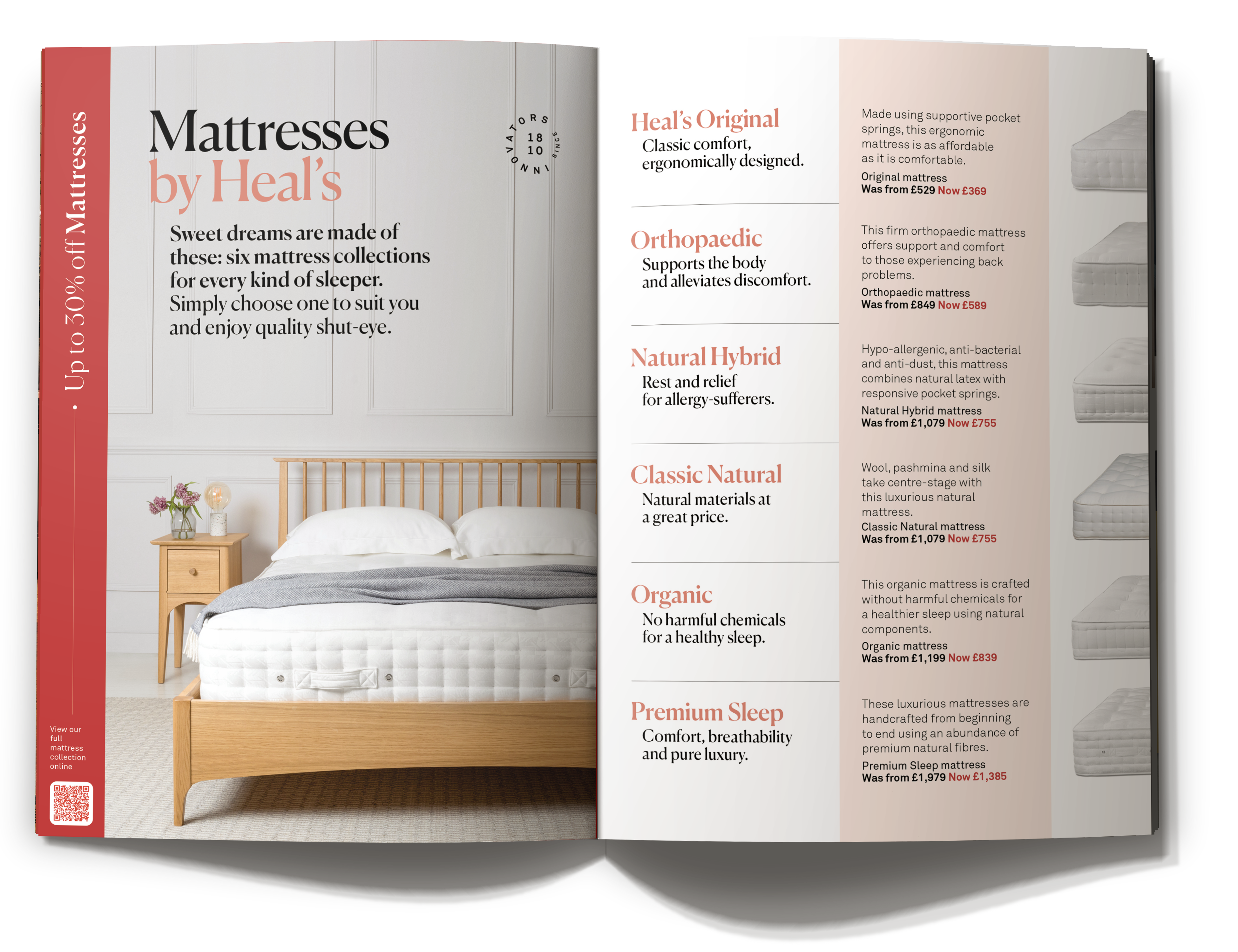
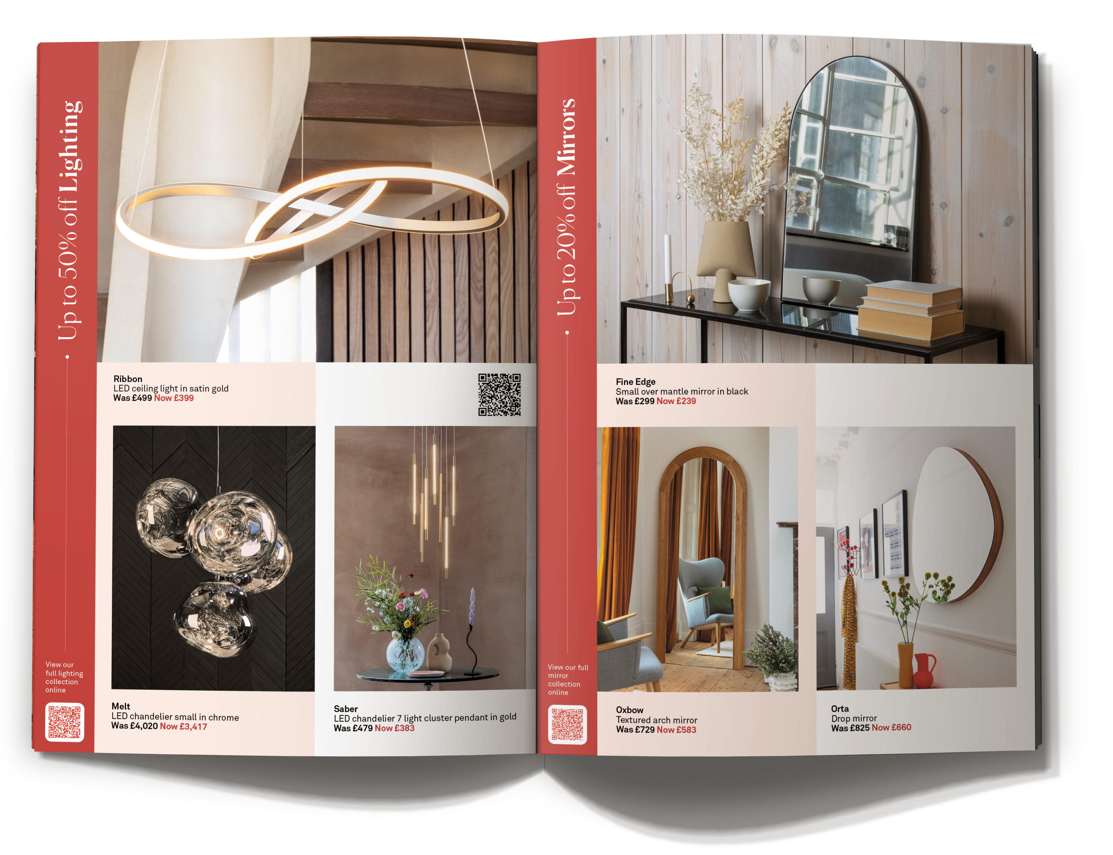
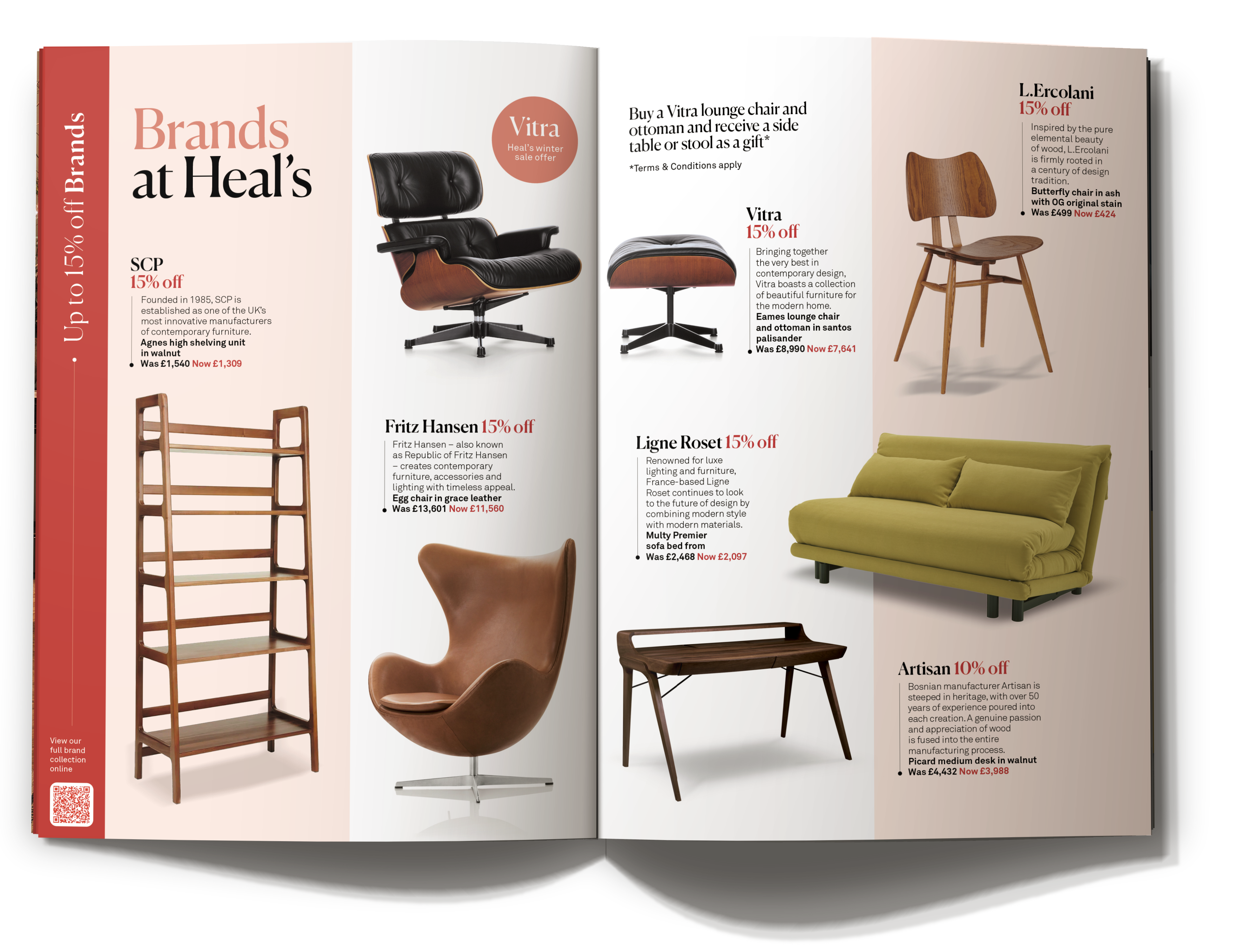
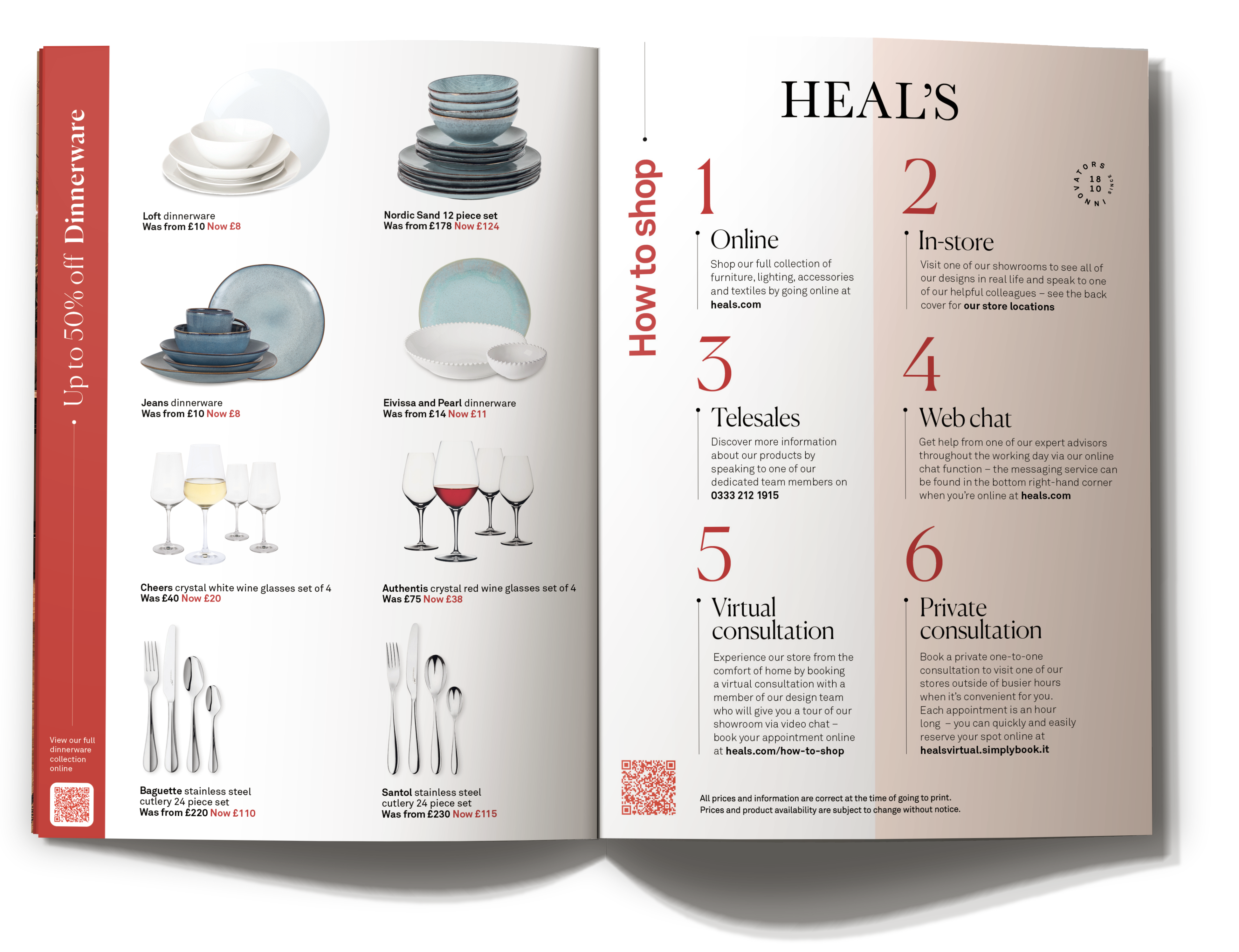
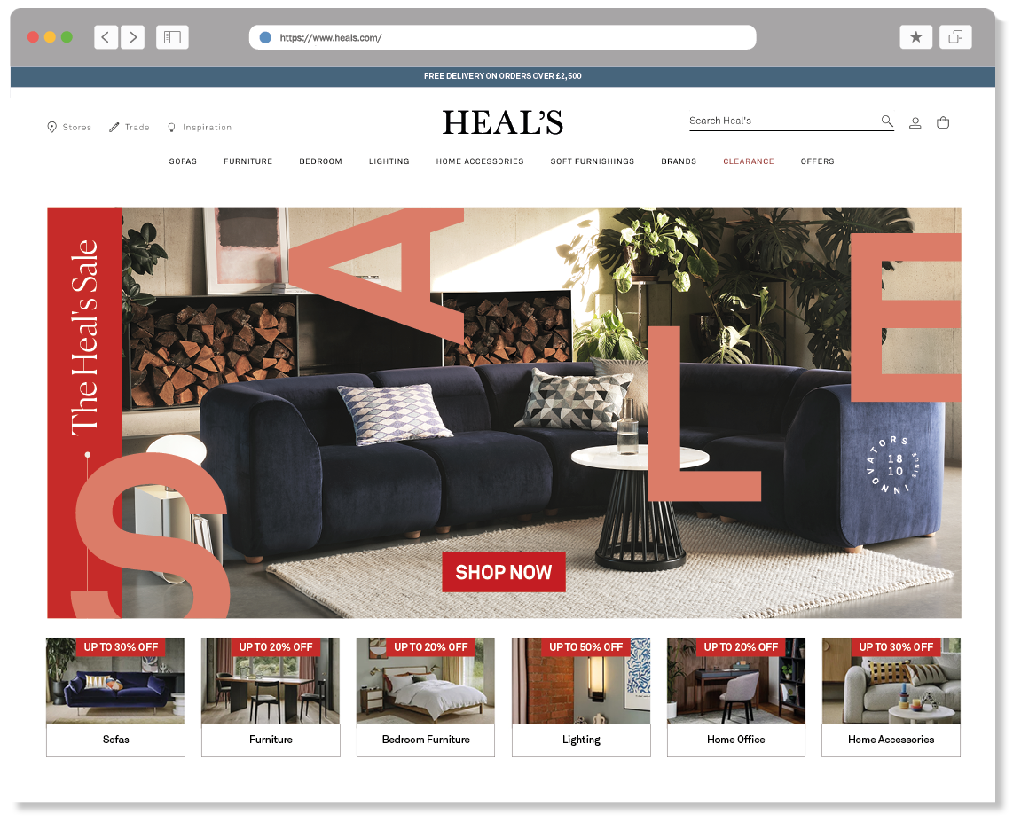
Sale campaigns are hard. They must be commercially successful, but also still look stylish.
I hope I managed to get the balance right here, juxtaposing huge letterforms with refined type and beautiful photography.
It turns out it was one of most profitable sales in the companies history.
Image editing / design assistance - Jacob Benjamin
Copywriter - Nicky Rampley-Clarke
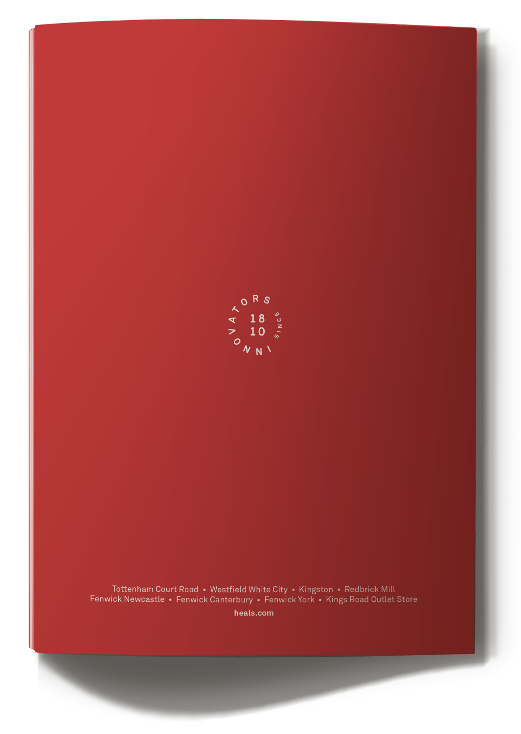
︎︎︎Sale brochure


︎︎︎Website
︎︎︎Westfield store window

︎︎︎Advertisment in The Sunday Times Style magazine

︎
︎Client – Heal’s
︎Role – Packaging Design / Graphic Design / Website Design
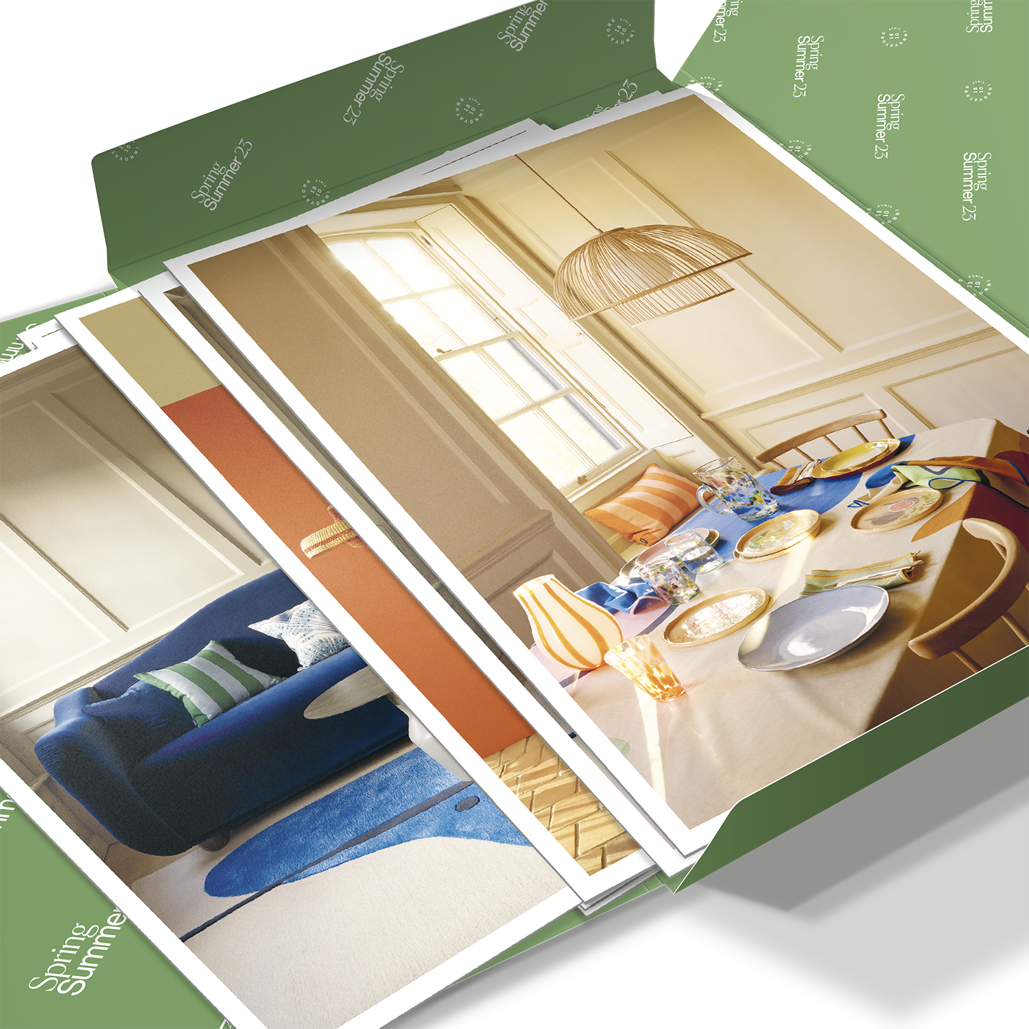
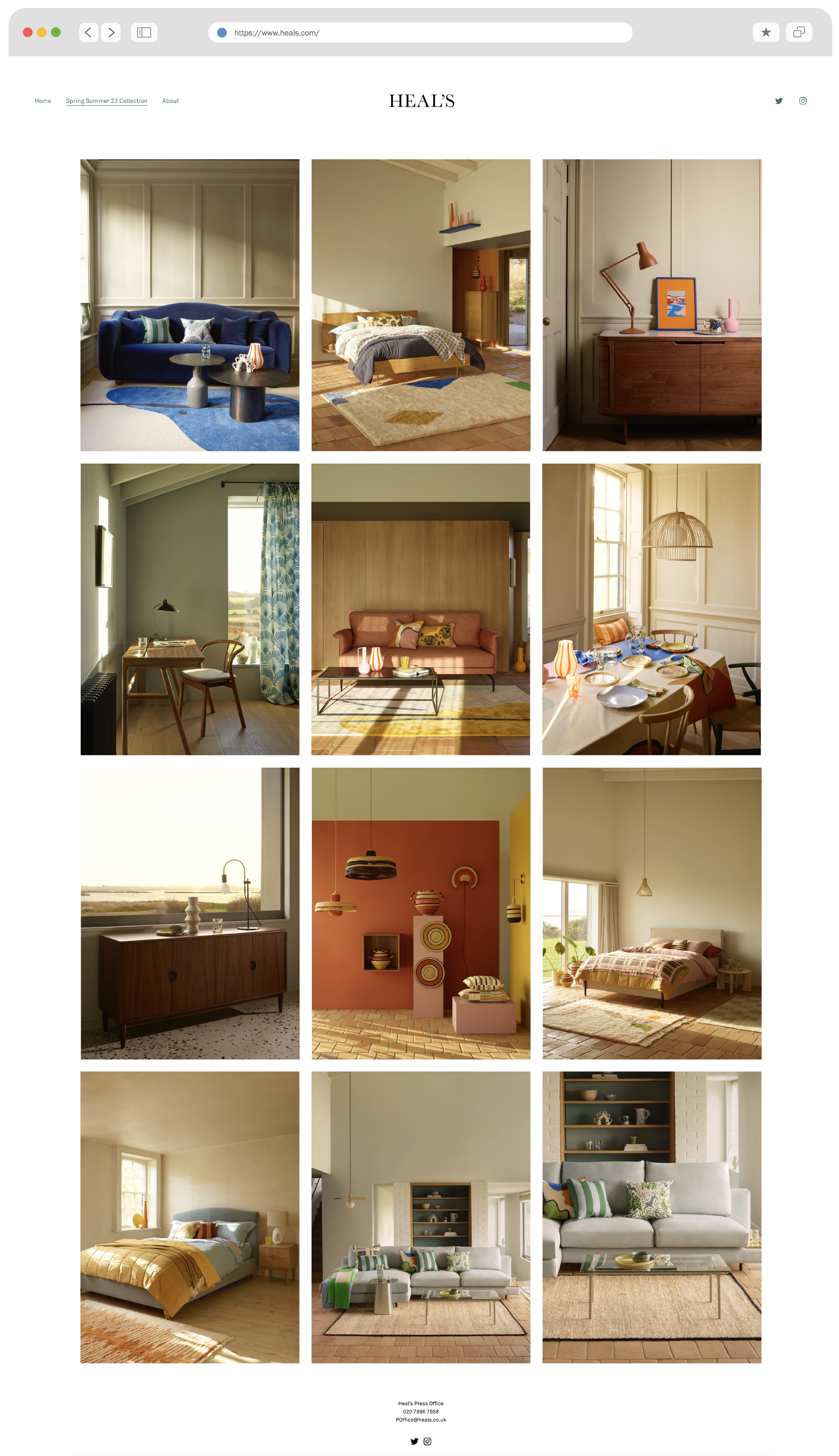
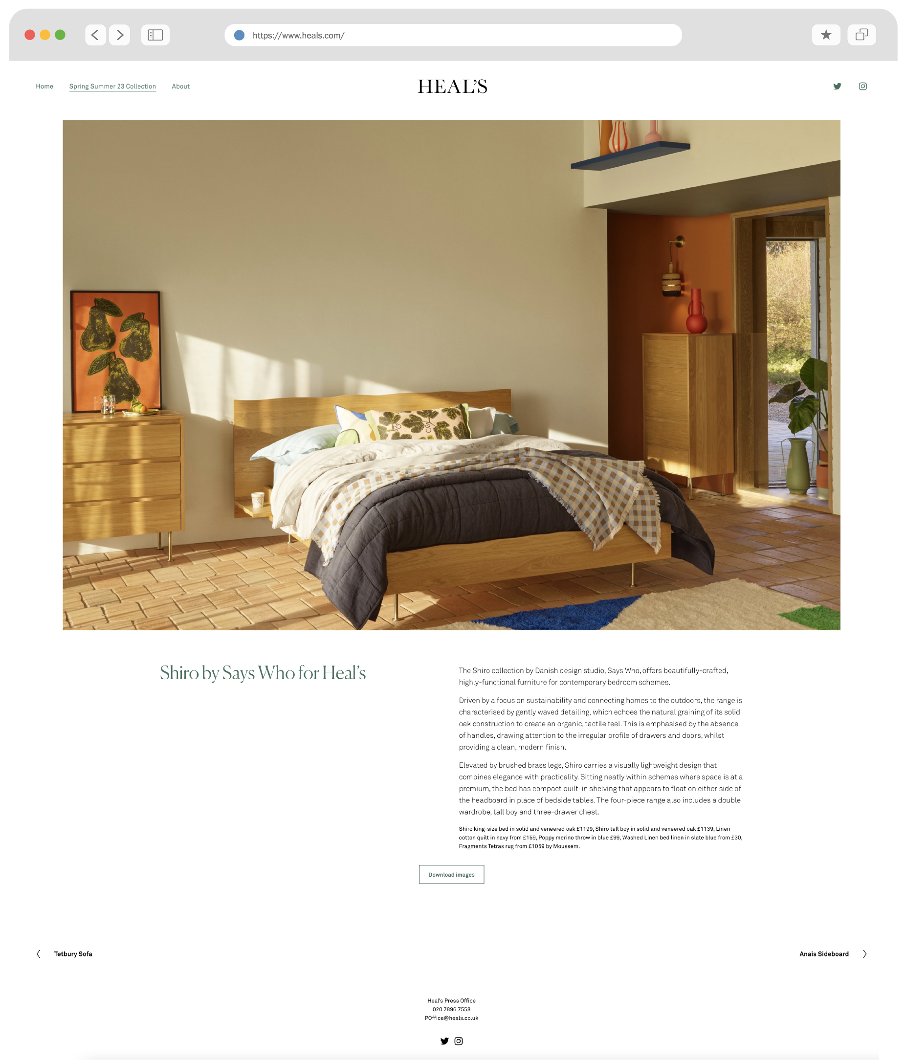
As retail returns to investing in more ‘touchy-feely’ printed materials post-covid, Heal’s was after a press pack to showcase their latest Spring / Summer collection for 2023.
The concept is to offer a series of A5 postcards for each piece, housed in a bespoke envelope, that gets mailed out to leading interior journalists to stoke interest.
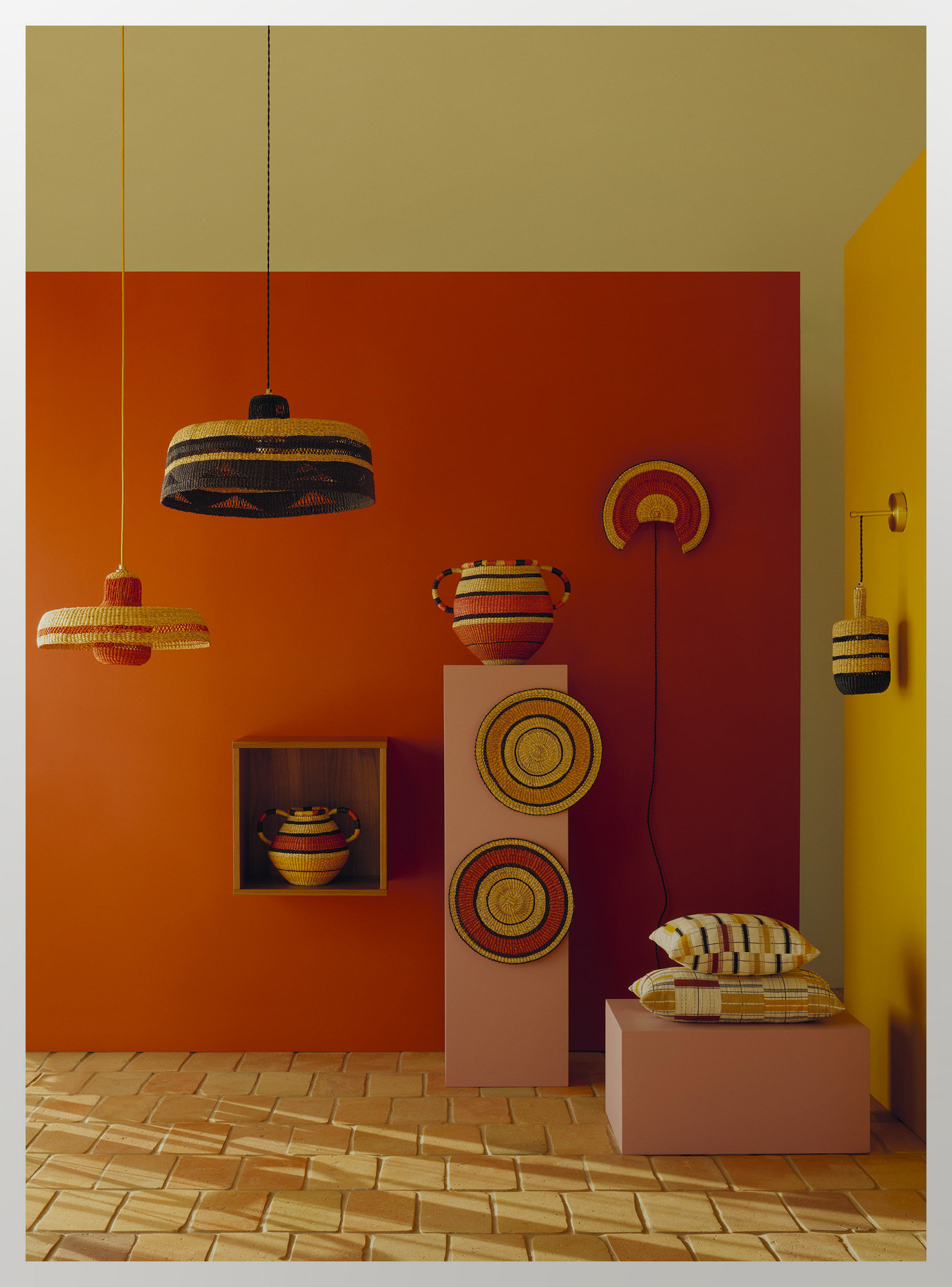
It’s a great format to physically present the incredible work done by our buyers, and marketing team, styled and photographed to perfection by our pick of the best in the industry.
As the pack acts as the very first touch-point for the new collection, the look and feel will be worked on closer to launch, so I paired an elegant logo lock-up with a fresh green palette, keeping the look refined and allowing the product and product story to shine.
I also built a stand-alone website for the collection, following the style of pack, with some flowing shapes to compliment the organic vibe of the season.
Photography Art Direction - Daniel Boden-Wilson
Product Stylist - Despina Curtis
Photography - Beth Evans
Copywriter - Nicky Rampley-Clarke
︎︎︎Press pack envelope & product cards


︎︎︎Selected product cards


︎︎︎Website

︎
︎Client – Heal’s
︎Role – Web design
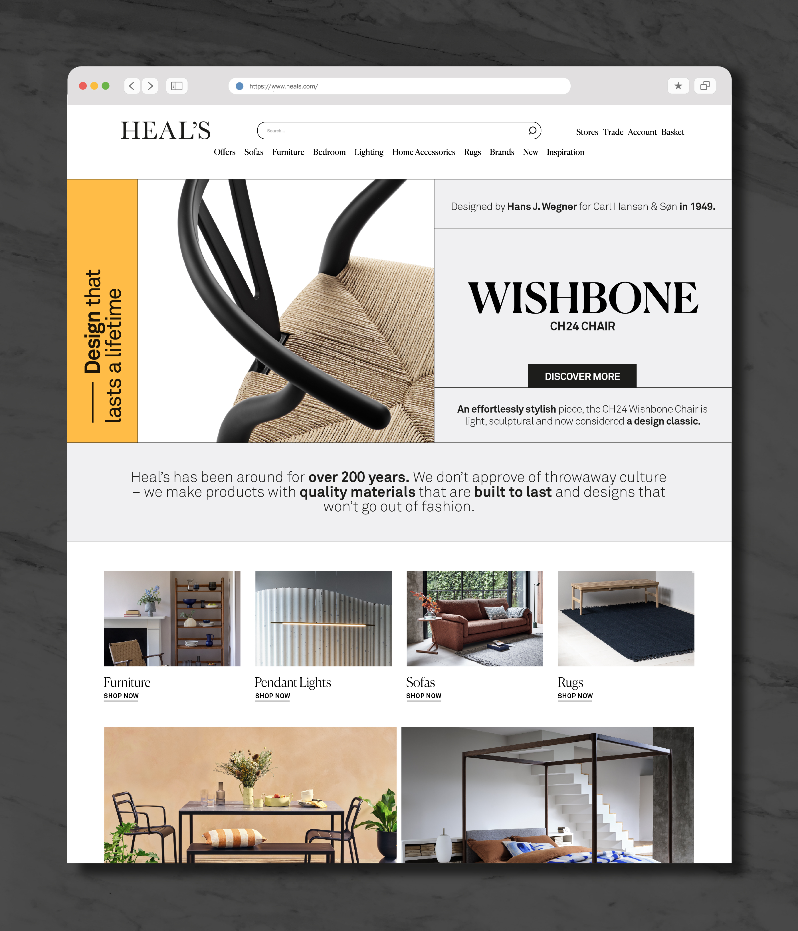
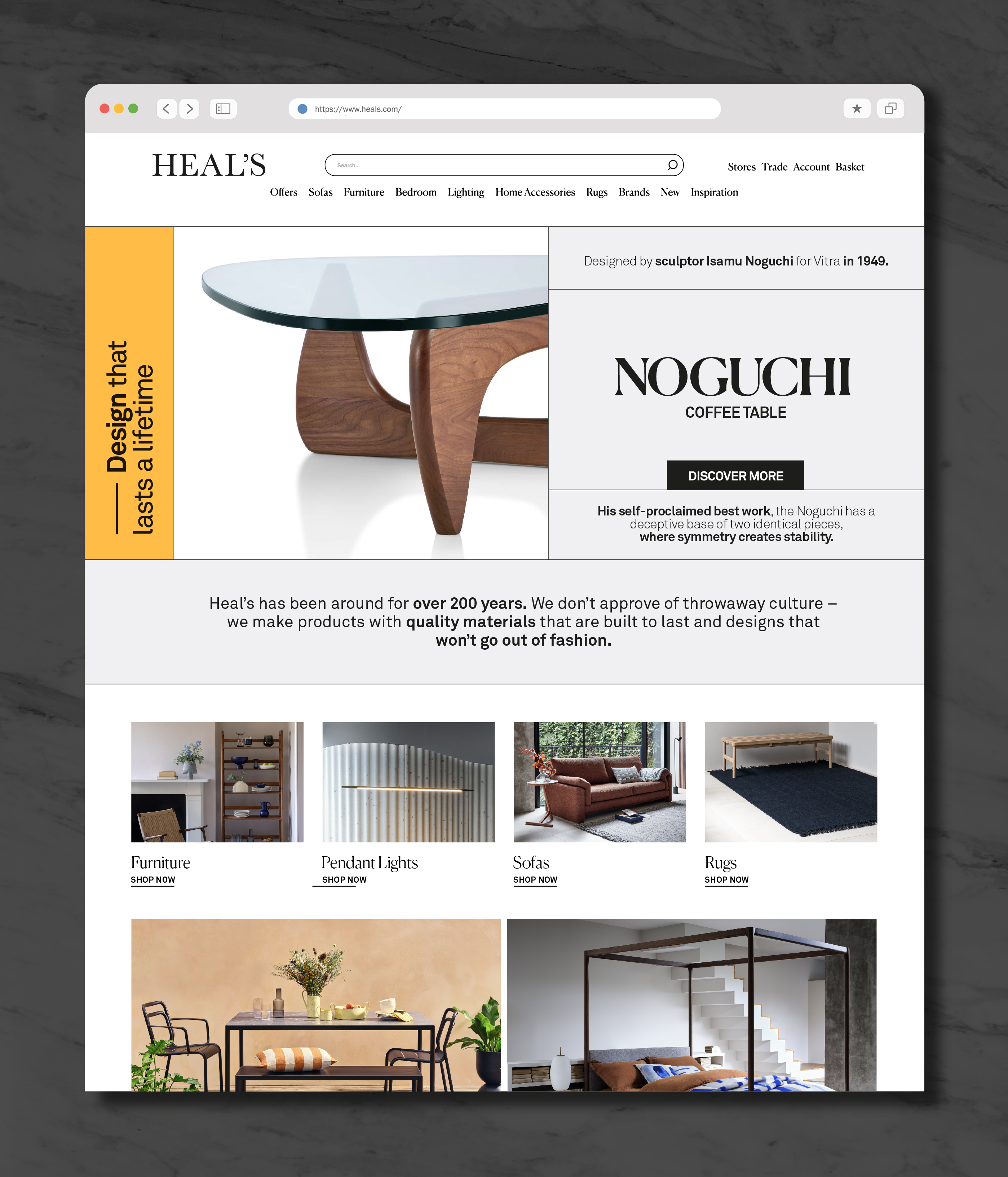
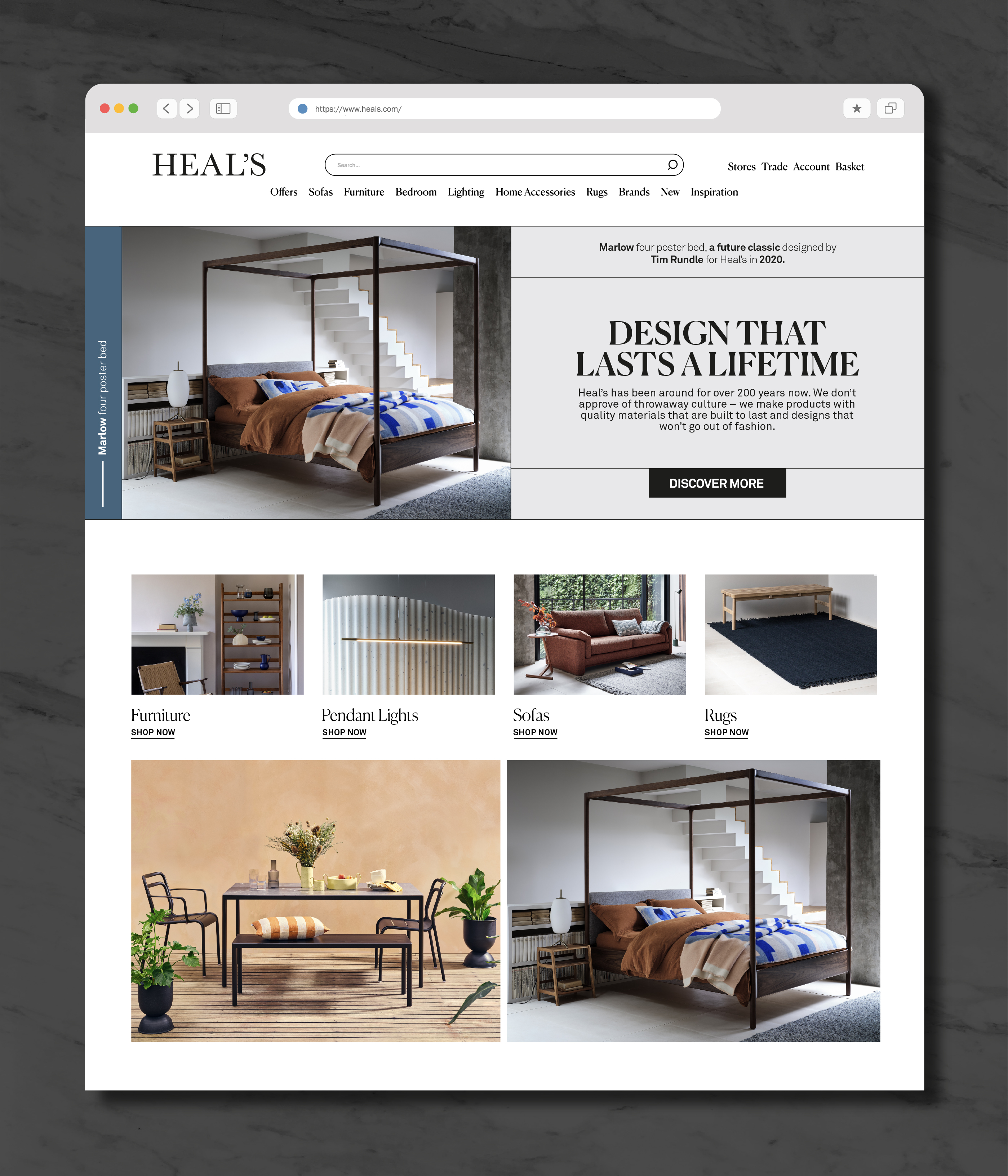
A web based campaign focusing on the key pieces from the Heal’s collection that imbue a sense of timelessness and longevity. Due to Covid restrictions all the stores were closed, so instead of working on the store window messaging, it gave me the chance to hone how the campaign would work online.
Based on a strict grid, emphasised with fine lines, the initial design used a yellow highlight, vertical type, and a bold san-serif font for the campaign title.
After review the title was swapped for a more conventional horizontal layout with a more refined serif font, and the highlight was set to the core blue of the Heal’s brand palette.
Both options presented here, I prefer my original yellow version but I’m not bitter. Website implementation by Zahra D’Anzi.
︎ www.heals.com
︎︎︎Final design for homepage banner and landing page
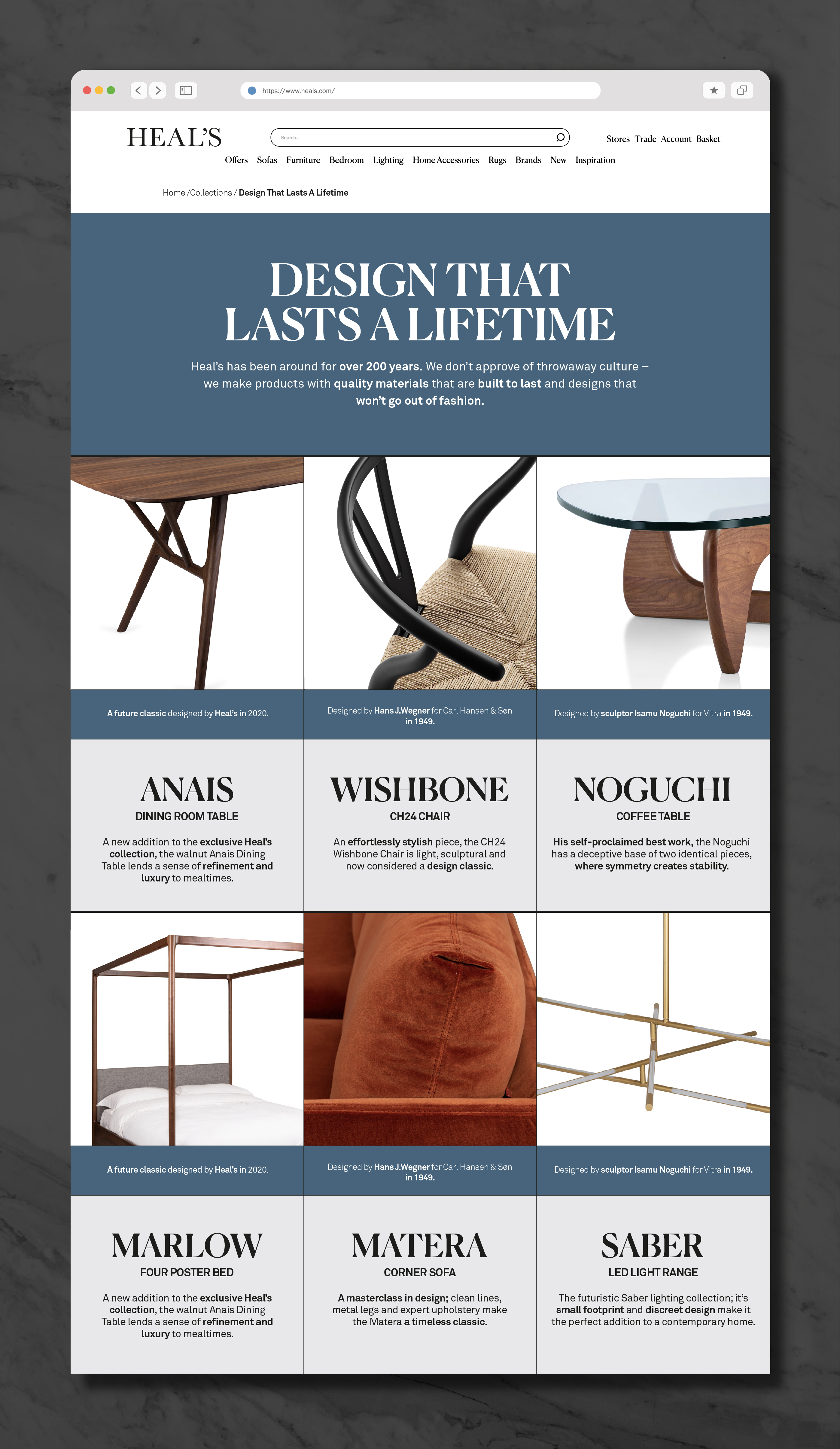
︎︎︎Initial designs for homepage and mobile