︎
︎Client – Heal’s
︎Role – Web design
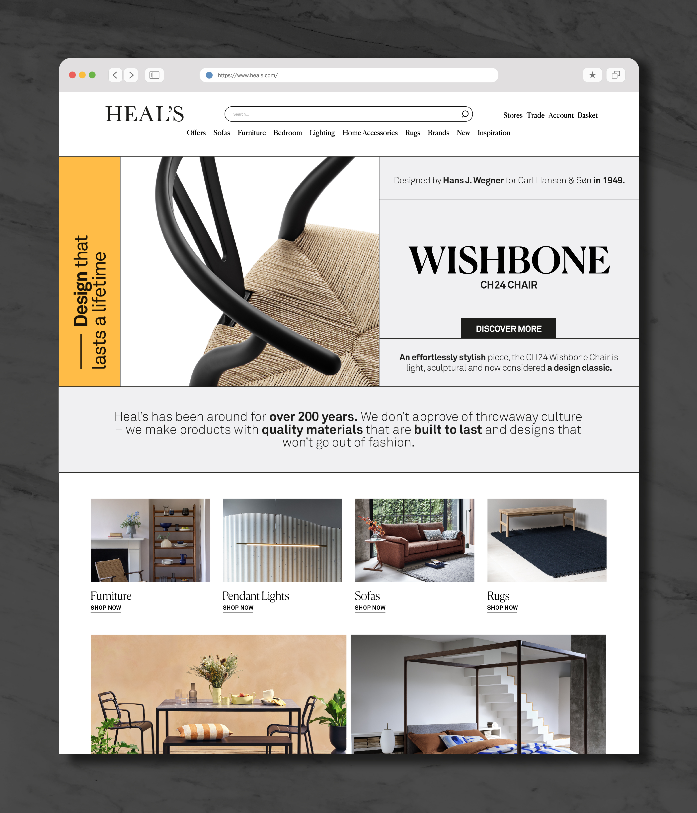
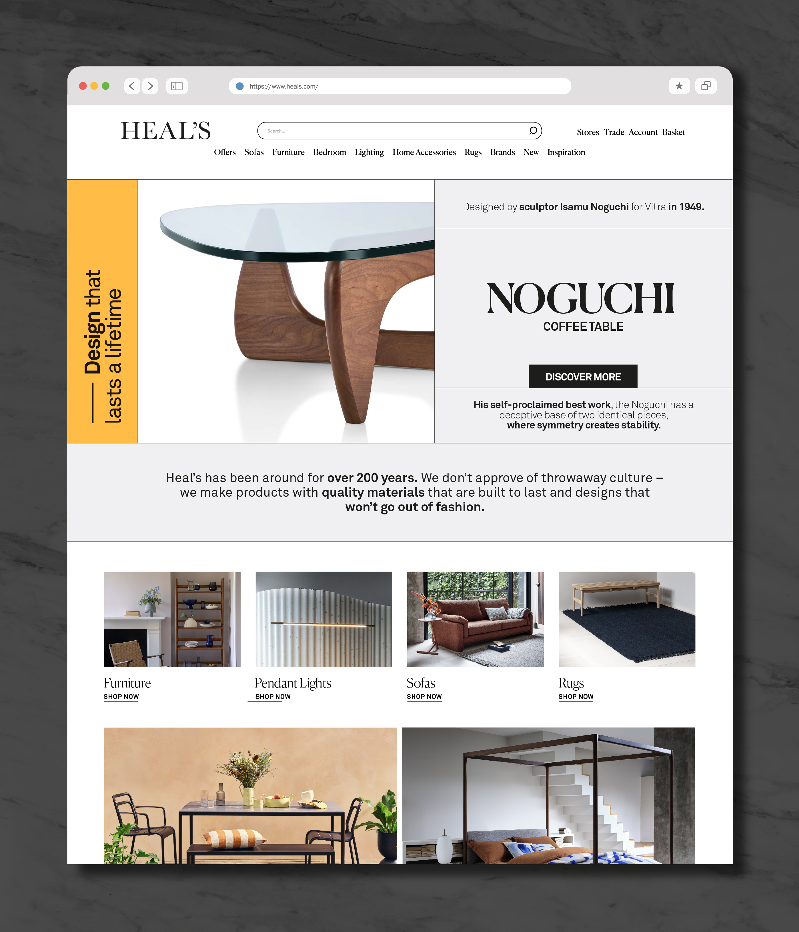
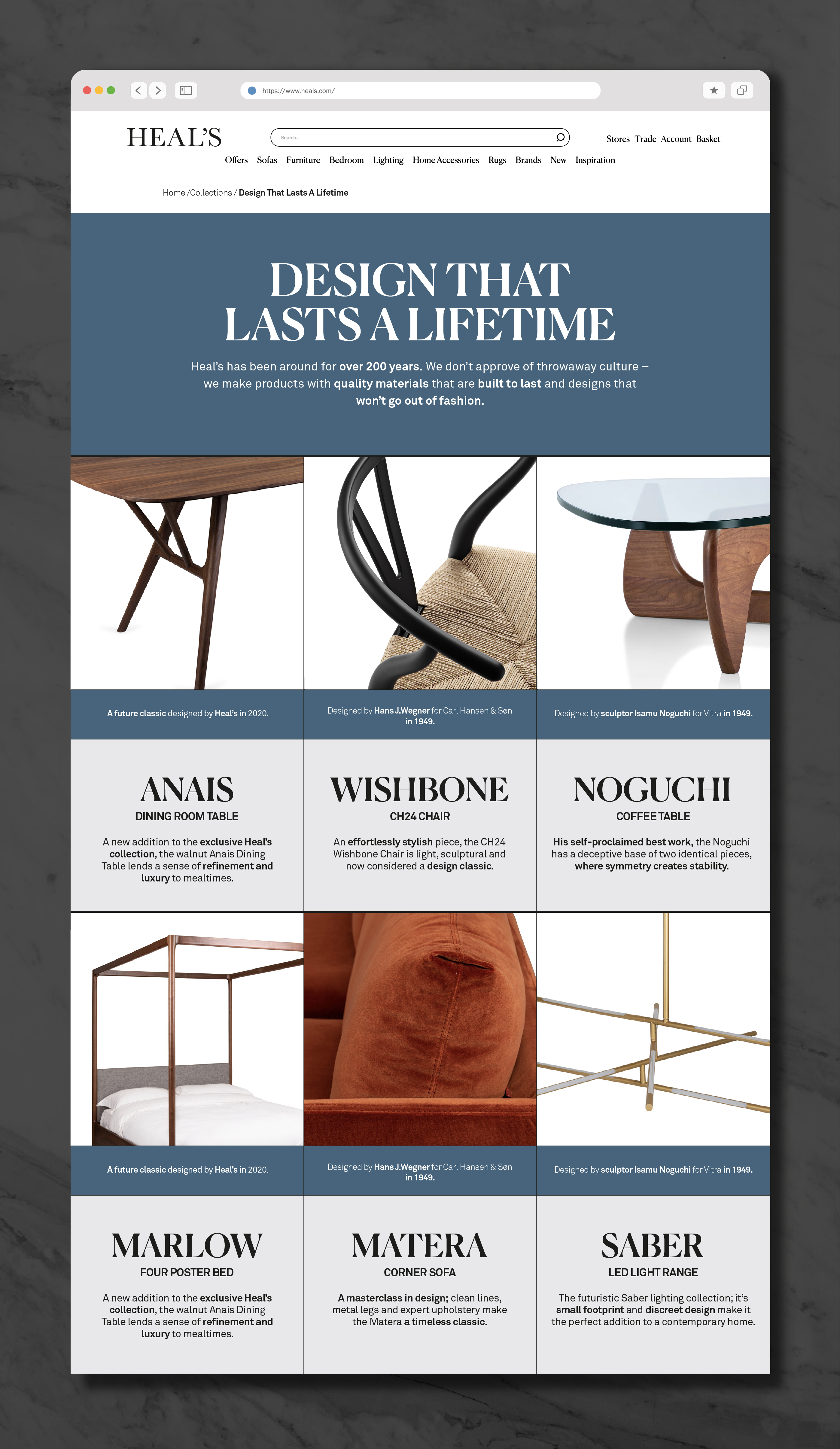
A web based campaign focusing on the key pieces from the Heal’s collection that imbue a sense of timelessness and longevity. Due to Covid restrictions all the stores were closed, so instead of working on the store window messaging, it gave me the chance to hone how the campaign would work online.
Based on a strict grid, emphasised with fine lines, the initial design used a yellow highlight, vertical type, and a bold san-serif font for the campaign title.
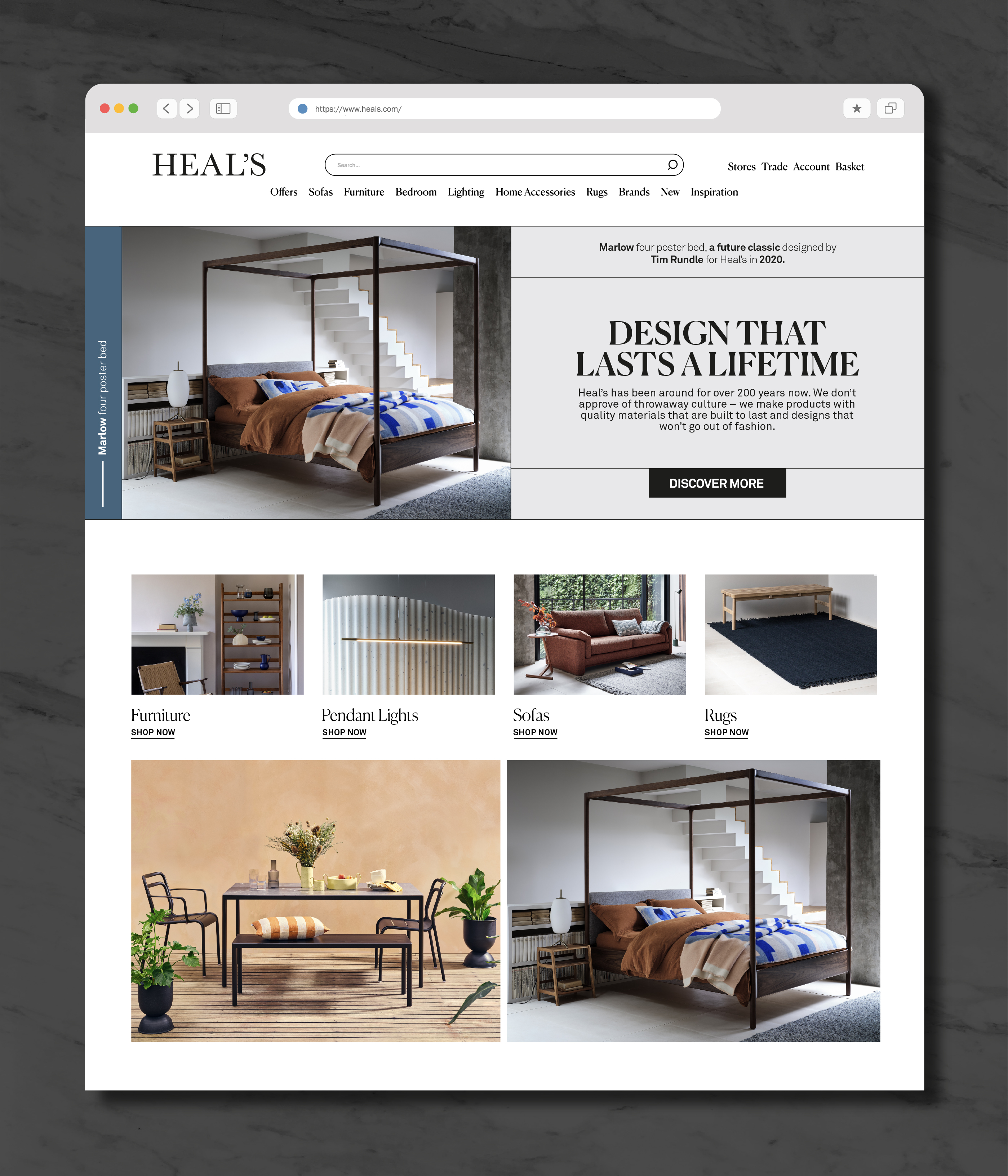
After review the title was swapped for a more conventional horizontal layout with a more refined serif font, and the highlight was set to the core blue of the Heal’s brand palette.
Both options presented here, I prefer my original yellow version but I’m not bitter. Website implementation by Zahra D’Anzi.
︎ www.heals.com
︎︎︎Final design for homepage banner and landing page
︎︎︎Initial designs for homepage and mobile