︎︎︎Design systems, campaigns and visual identities for music, retail and cultural projects.︎︎︎Scroll down for selected work.
︎
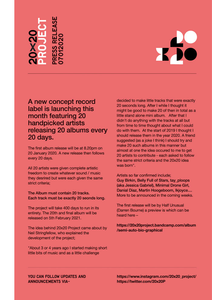
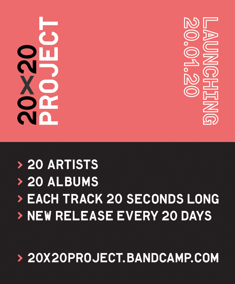
20x20 project
︎︎︎Identity for a digital record label
︎︎︎︎︎︎︎︎︎
︎
︎Client – Neil Stringfellow
︎Role – Graphic Design / Photography / Web design / Print advertising / Social media / Press releases
Identity design for a digital only record label.
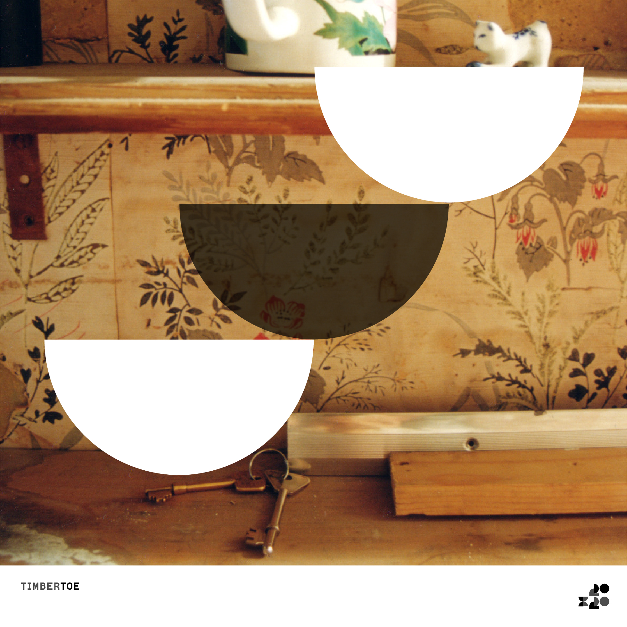
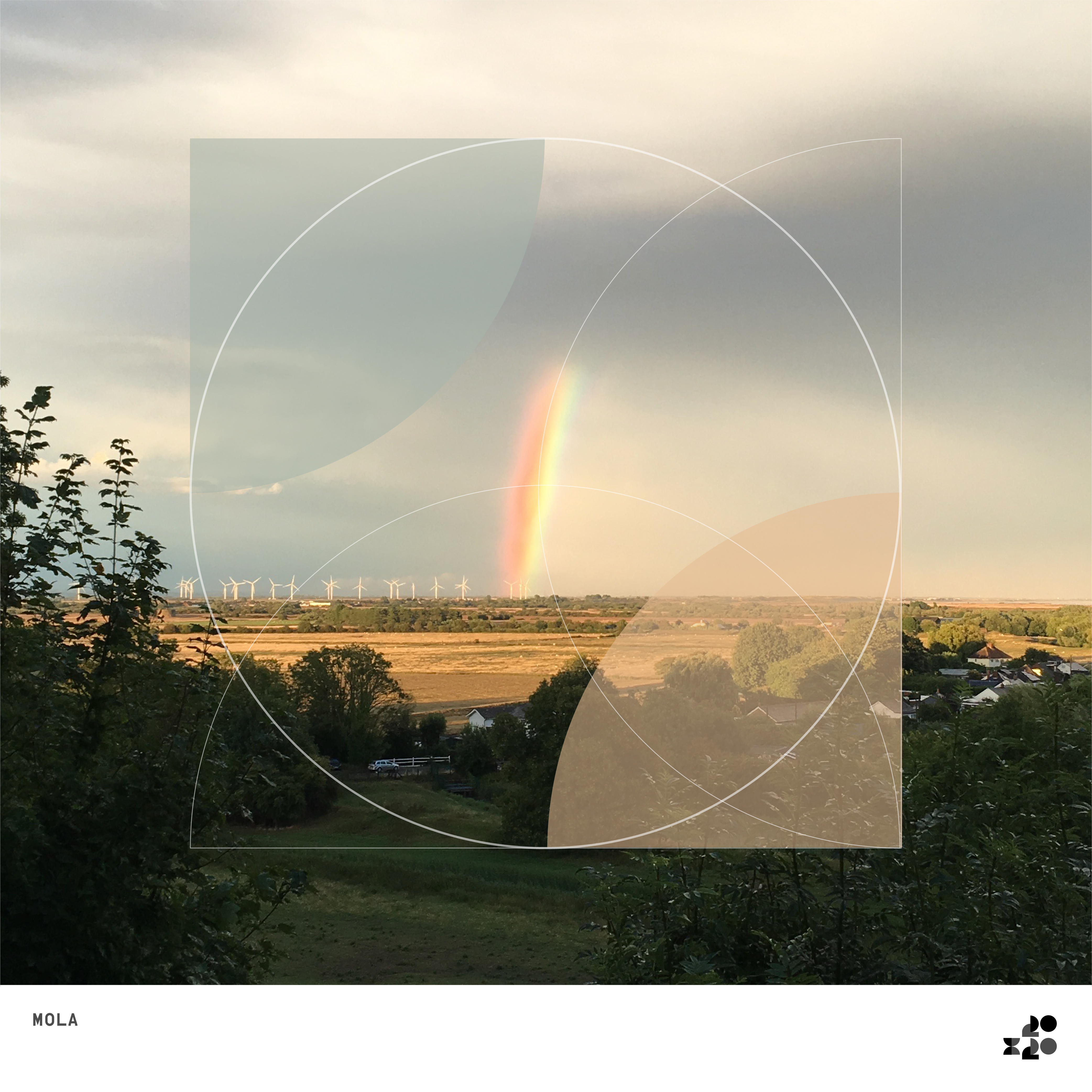
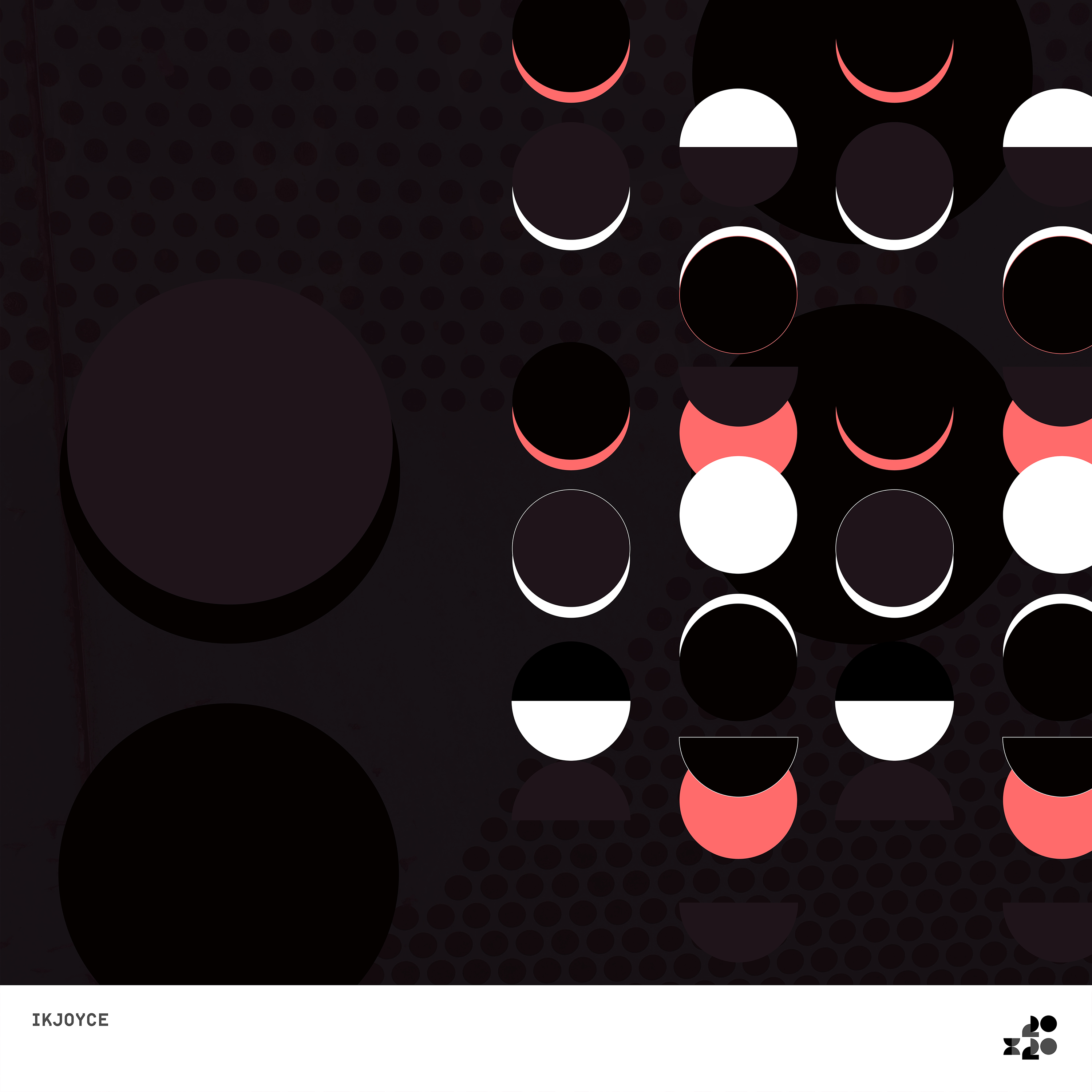
Twenty artists, releasing an album each month of 2020, each album contains twenty tracks each one twenty seconds long.
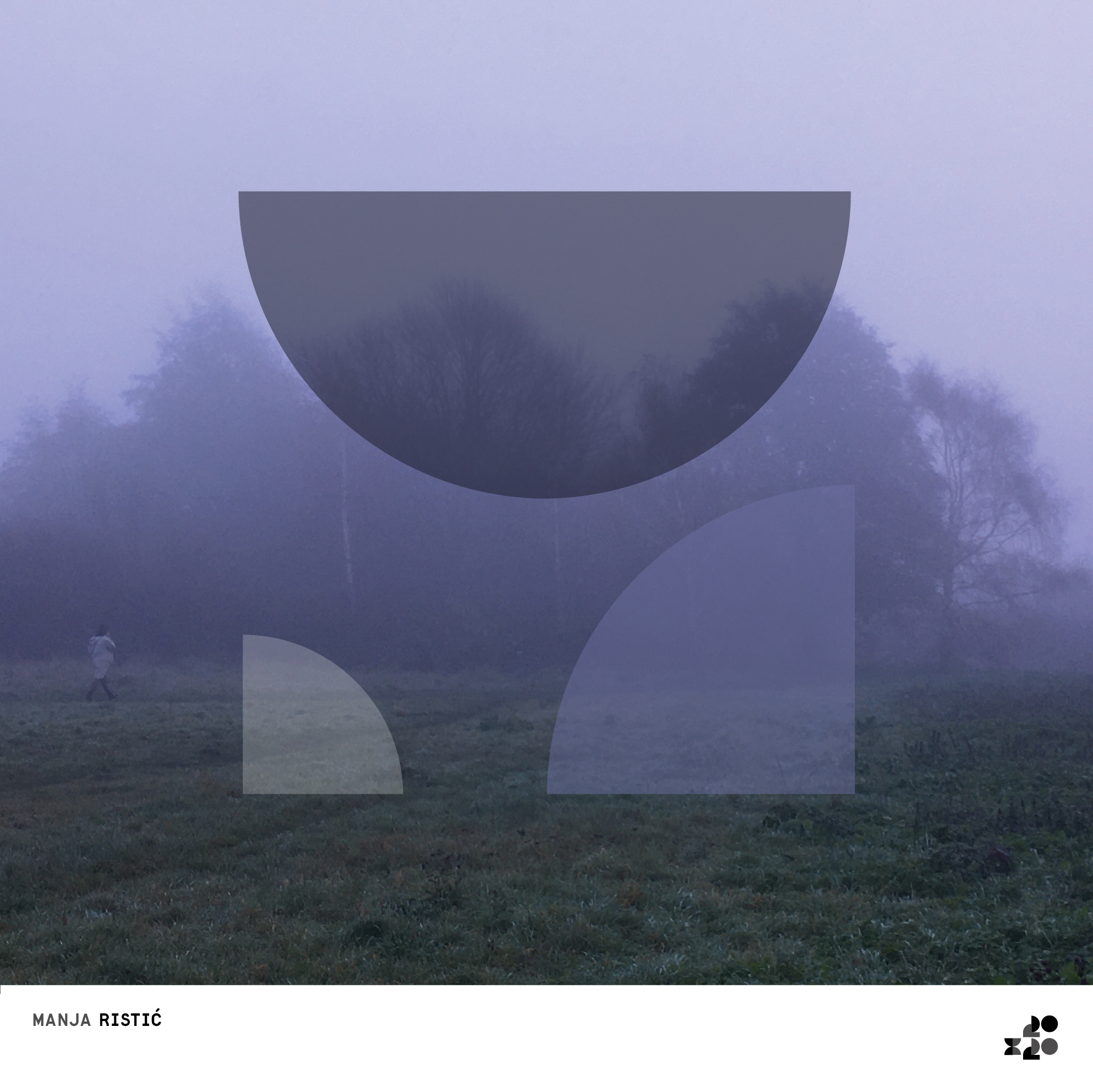
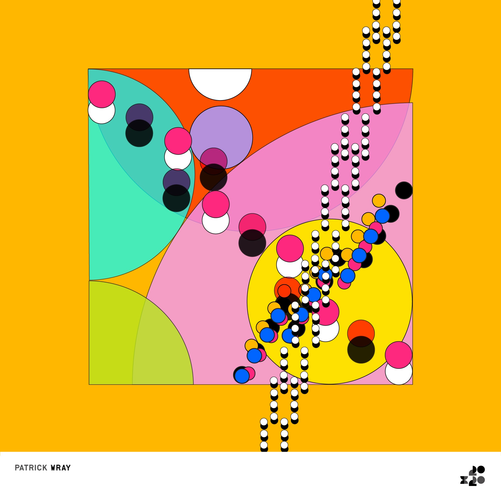
The design is based on using a set of very simple geometric shapes and reconfiguring them to create new patterns.
Each cover is an attempt to match the mood of the music, rather than create an austere, detached system.
This was the perfect lockdown project for me, because I was often forced to source images around my home in Walthamstow. So it got me out of the house, in the fresh air, on my bike, really thinking photographically about what would suit the music of each release.
For each release I also put together an Instagram story, which has put me on a path to learn more, and think much more deeply about motion design.
︎ ︎ Bandcamp
︎ ︎ Instagram
︎ ︎ Twitter
 ︎︎︎Logo
︎︎︎Press release
︎︎︎ Bandcamp website
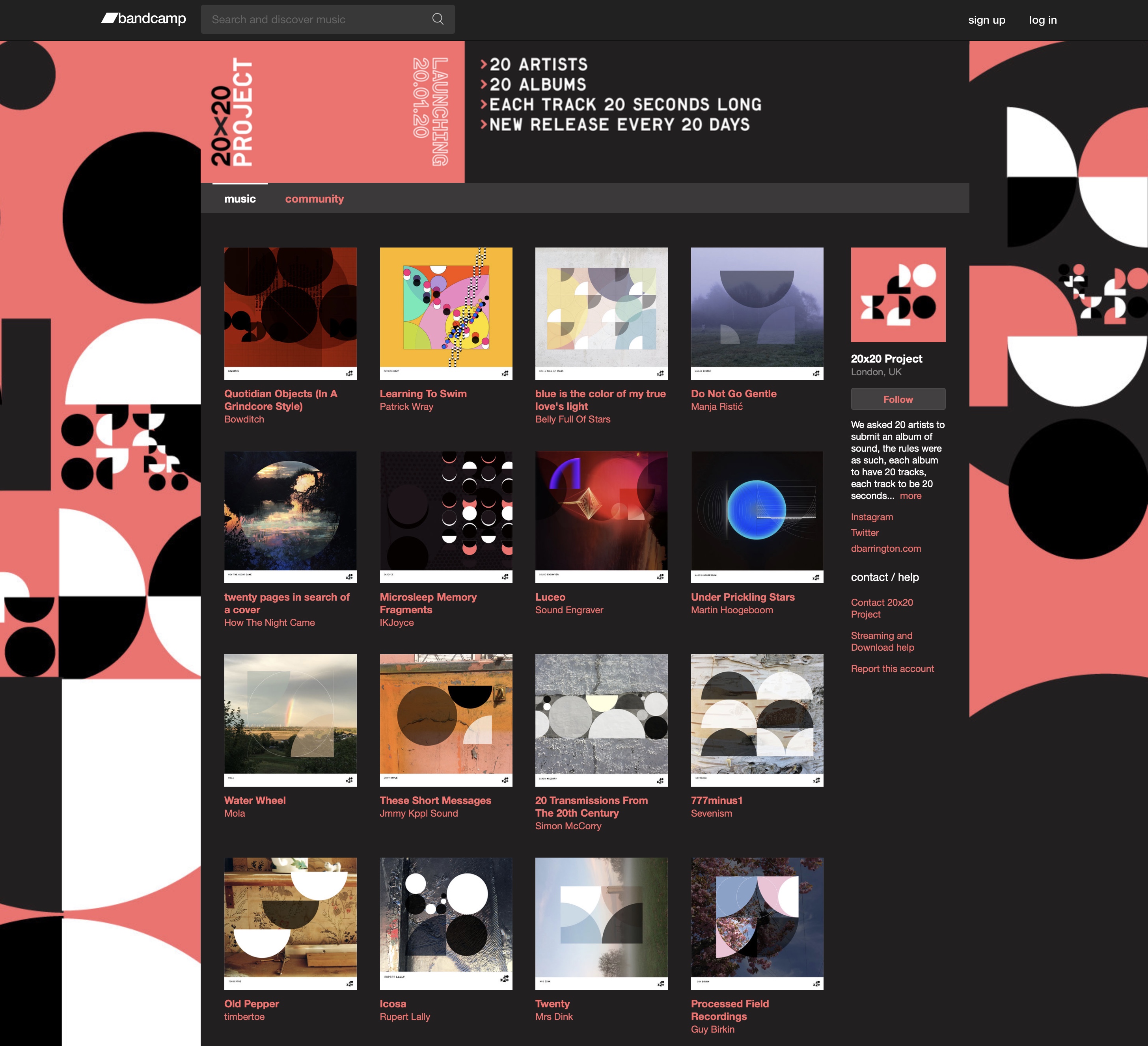

︎︎︎ Album covers
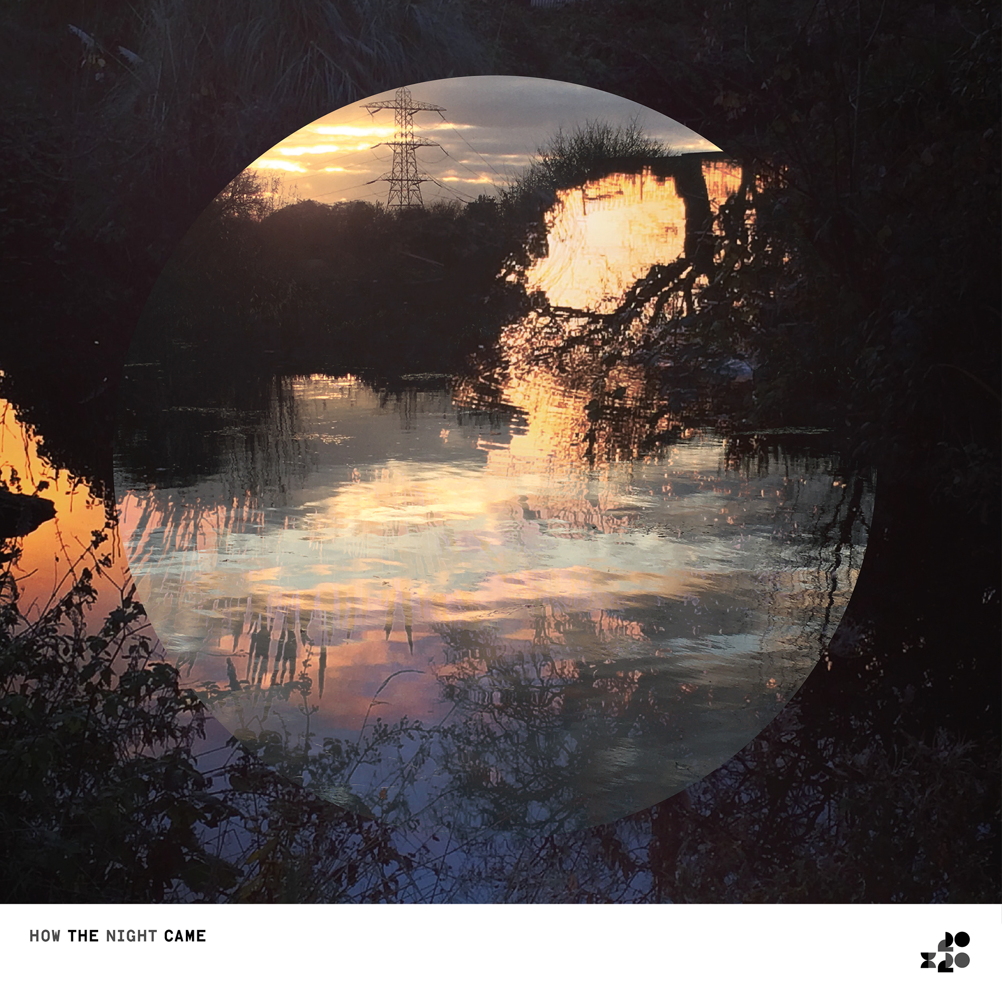
 ︎︎︎Album 01 – Location – Casson Pavillion, London Zoo, Regents Park, North London https://maps.app.goo.gl/Lmsoi7cHtbJdQjrdA
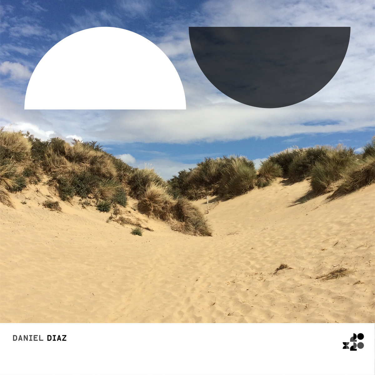 ︎︎︎Album 02 – Location – Sand dunes, Camber Sands beach, East Sussex https://maps.app.goo.gl/sRZqvS6UKk47szYh6
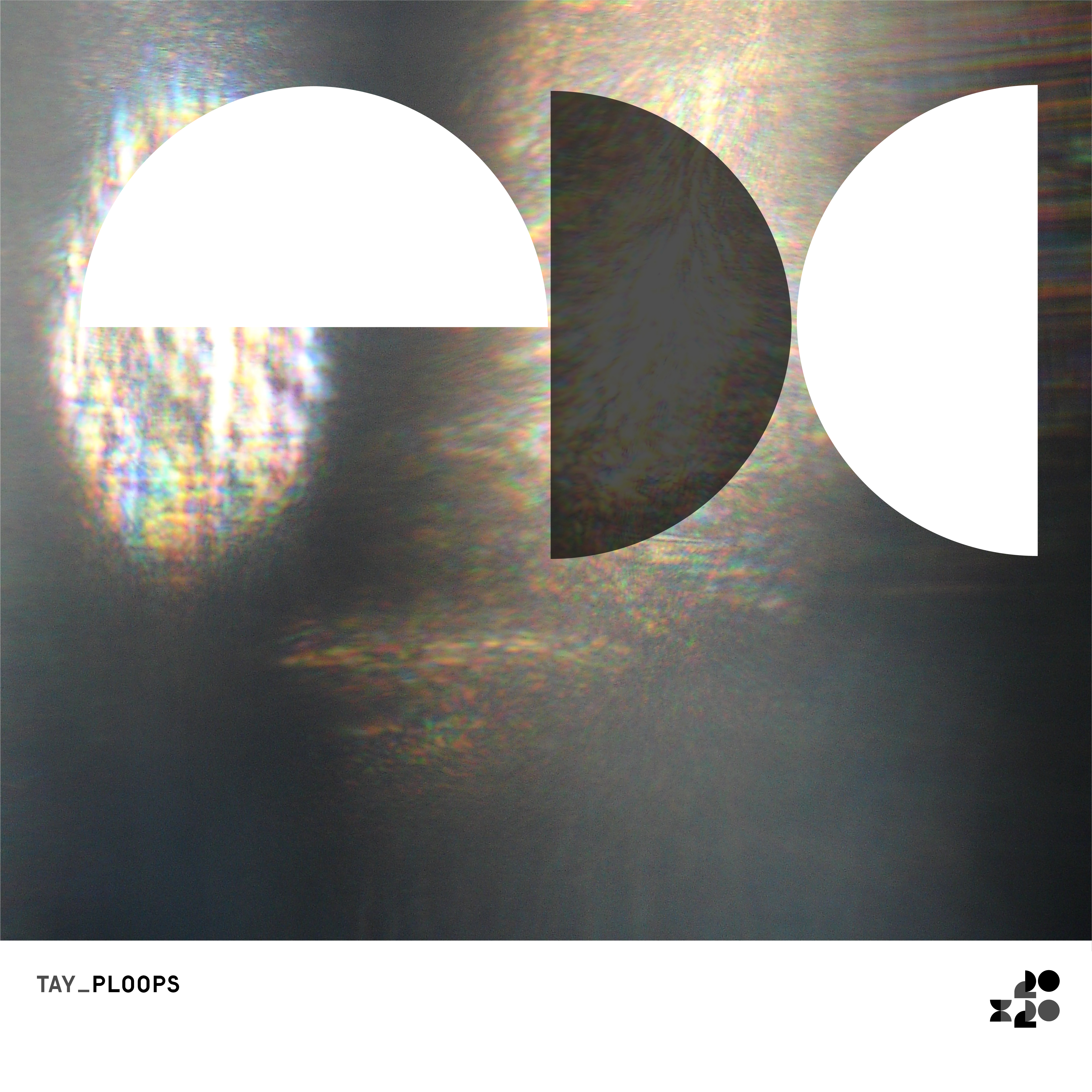
︎︎︎Album 03 – Location – Tabletop with glass, Quernmore Road, Harringey, North London https://maps.app.goo.gl/fzmqTahAF9orrGfWA
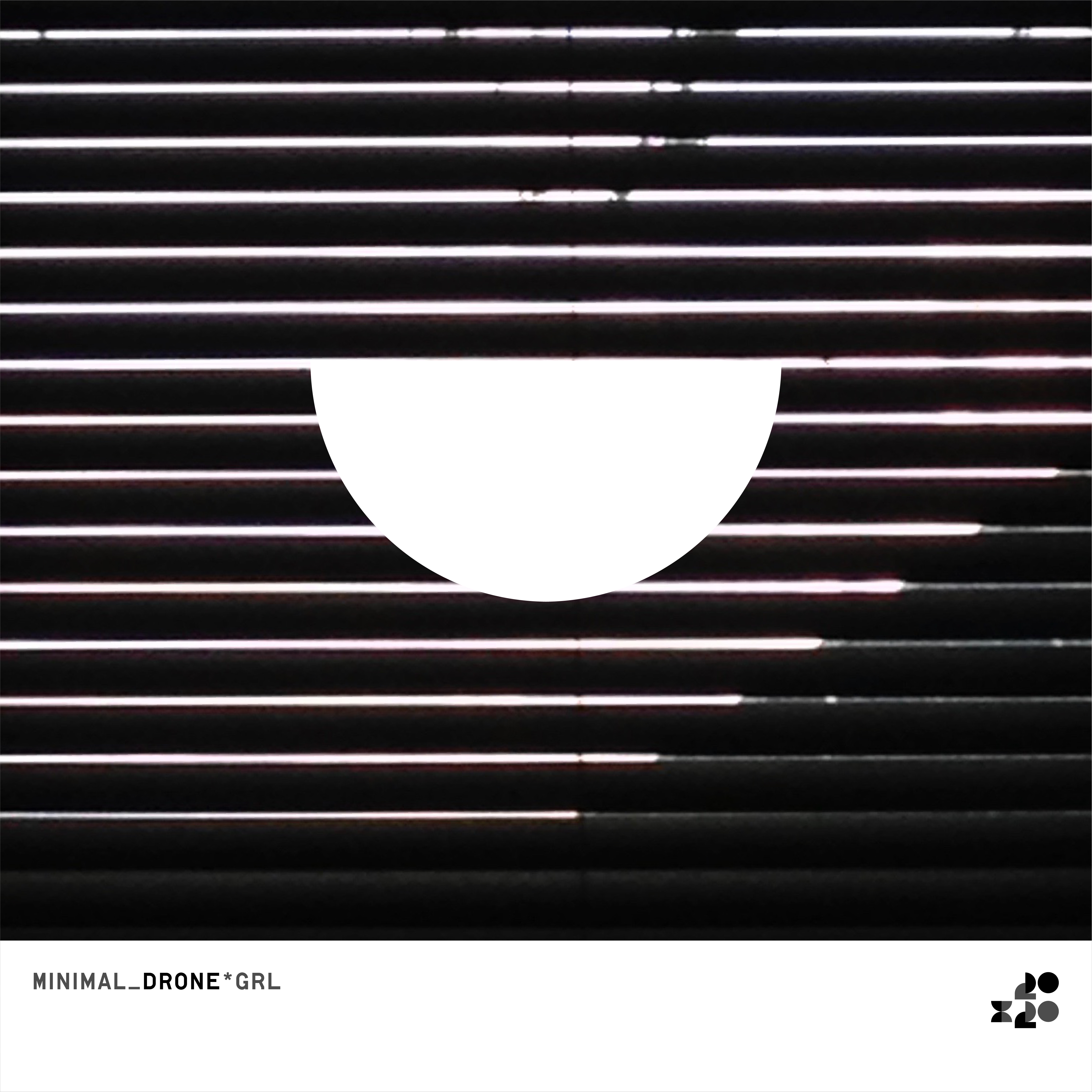
︎︎︎Album 04 – Location – Venetian blinds, Quernmore Road, Harringey, North London https://maps.app.goo.gl/fzmqTahAF9orrGfWA

︎︎︎Album 05 – Location – Cherry Trees, Carr Road, Walthamstow, East Londonhttps://maps.app.goo.gl/UVXUDN631GZ9yFdc8

︎︎︎Album 06 – Location – Landscape, Hackney Downs Park, East London https://maps.app.goo.gl/jtVL9kEVbLMMxuvX7

︎︎︎Album 07 – Location – Wooden painted texture, Queen Elizabeth Road, Walthamstow, East London https://maps.app.goo.gl/GaHLHsMh9aVxZAoRA
︎︎︎Album 08 – Location – Interior, Quernmore Road, North London https://maps.app.goo.gl/fzmqTahAF9orrGfWA
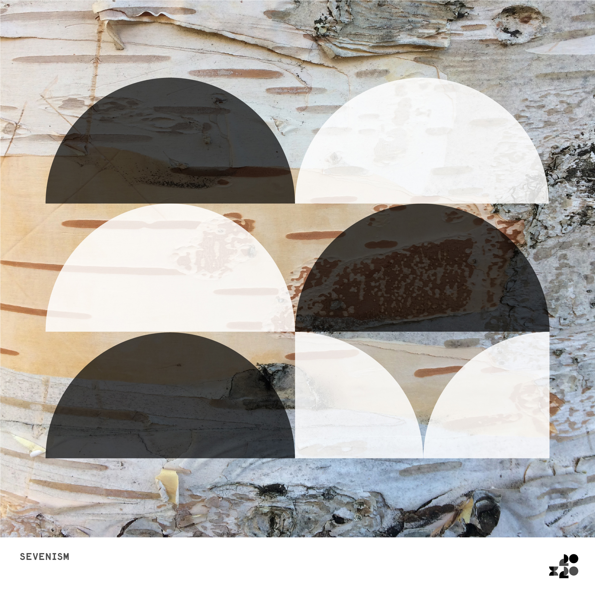
︎︎︎Album 09 – Location – Silver Birch Trees, Winns Avenue, Walthamstow, East London https://maps.app.goo.gl/yqGCPR5BuFdn2NGn9

︎︎︎Album 10 – Location – Wall texture, Essex Road, Walthamstow, East London https://maps.app.goo.gl/M5p5ycm82GJAFBeQ8

︎︎︎Album 11 – Location – Newspaper storage box, Forest Road, Walthamstow, East London https://maps.app.goo.gl/XPguFyE389KzyCCL9
︎︎︎Album 12 – Location – https://maps.app.goo.gl/XPguFyE389KzyCCL9

︎︎︎Album 13 – Location – Virtual, Apple Macintosh Hardware, Carr Road, Walthamstow, East London

︎︎︎Album 14 – Location –
︎︎︎Album 15 – Location – Virtual, Apple Macintosh Hardware, Carr Road, Walthamstow, East London
︎︎︎Album 16 – Location –
︎︎︎Album 17 – Location –

︎︎︎Album 18– Location – Virtual, Apple Macintosh Hardware, Carr Road, Walthamstow, East London
︎︎︎Album 19– Location – Virtual, Apple Macintosh Hardware, Carr Road, Walthamstow, East London

︎︎︎Album 20 – Location – Virtual, Apple Macintosh Hardware, Carr Road, Walthamstow, East London
︎︎︎Animated gif for Twitter
︎︎︎Print advertising for The Wire magazine
︎︎︎ Instagram stories
︎
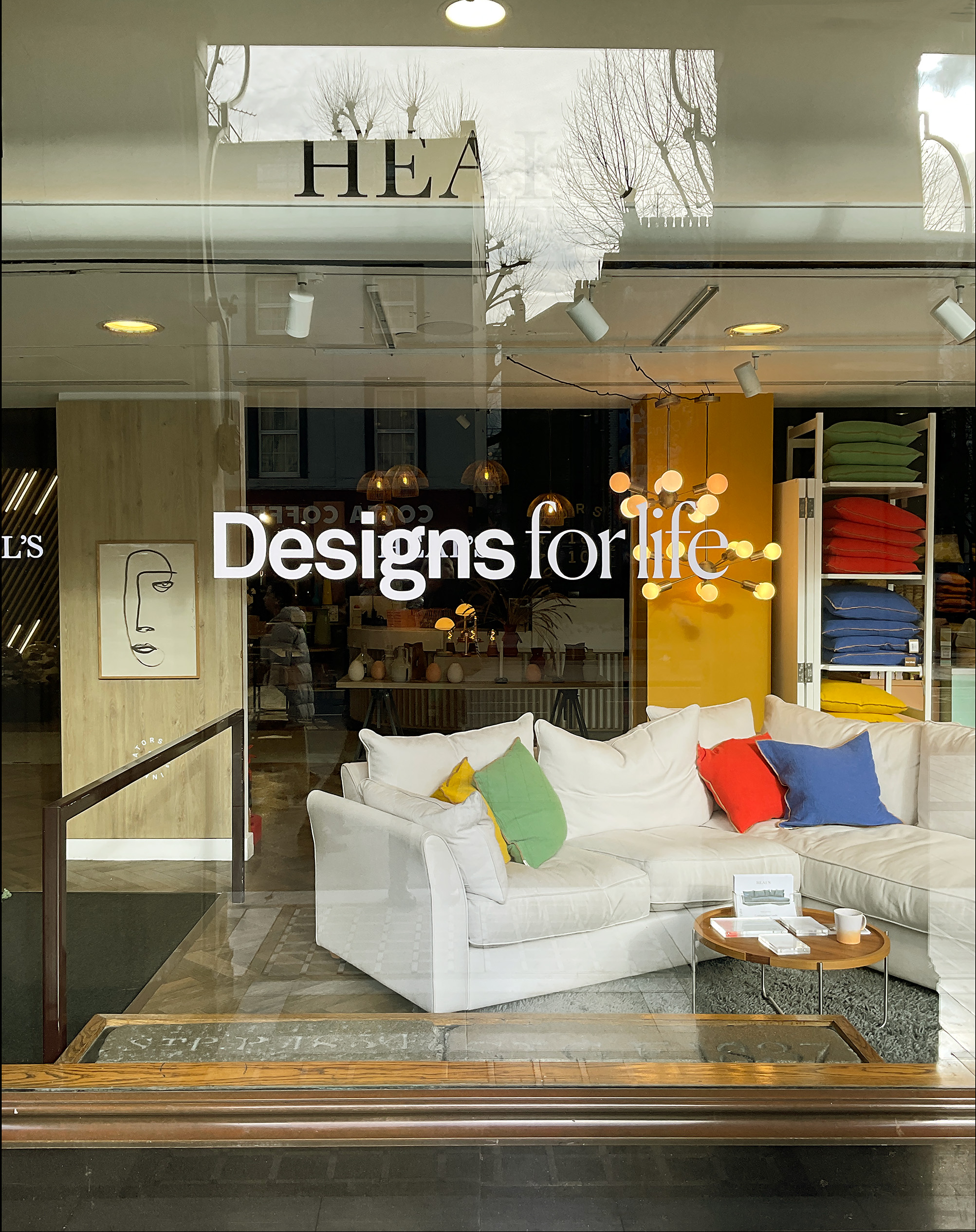
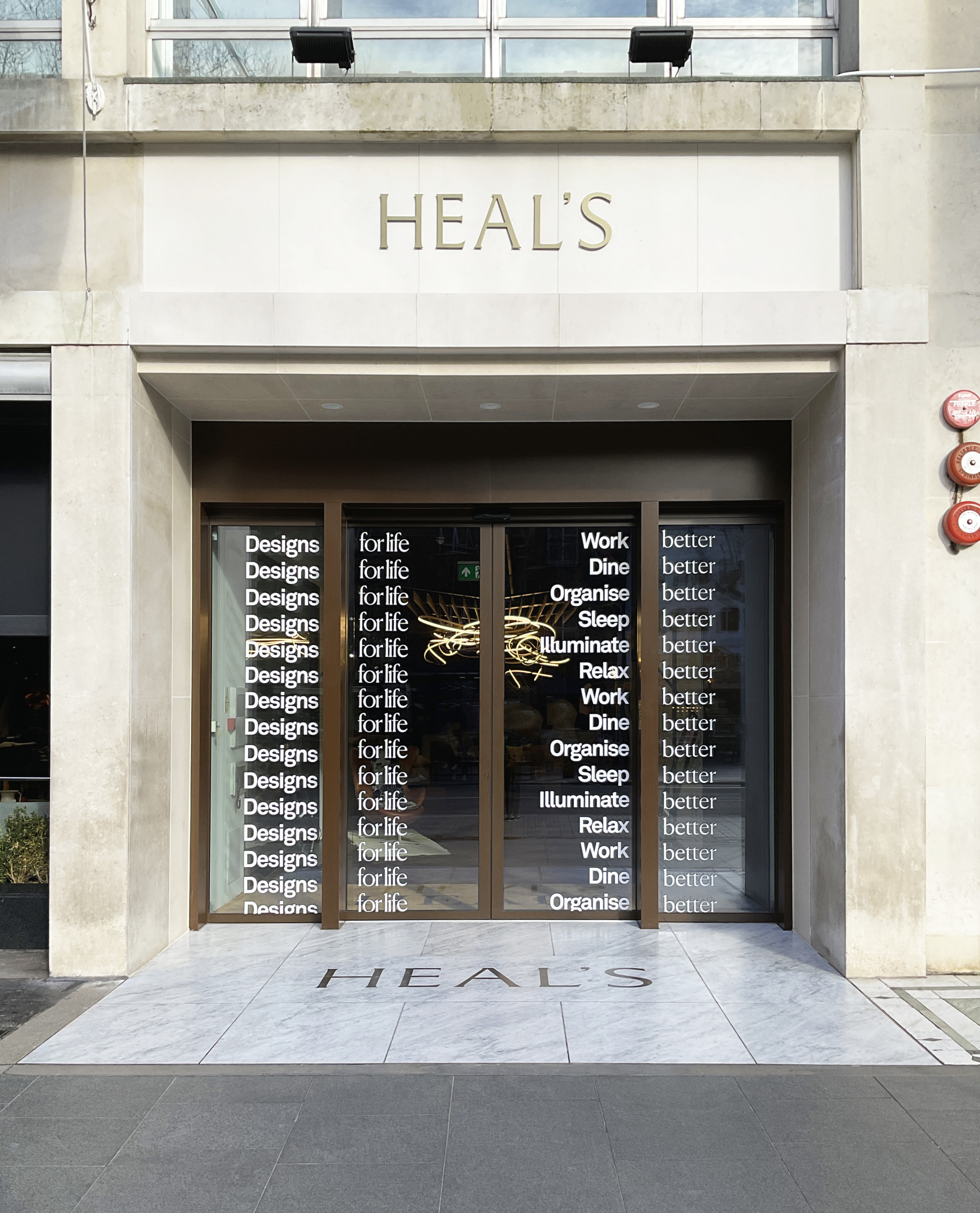
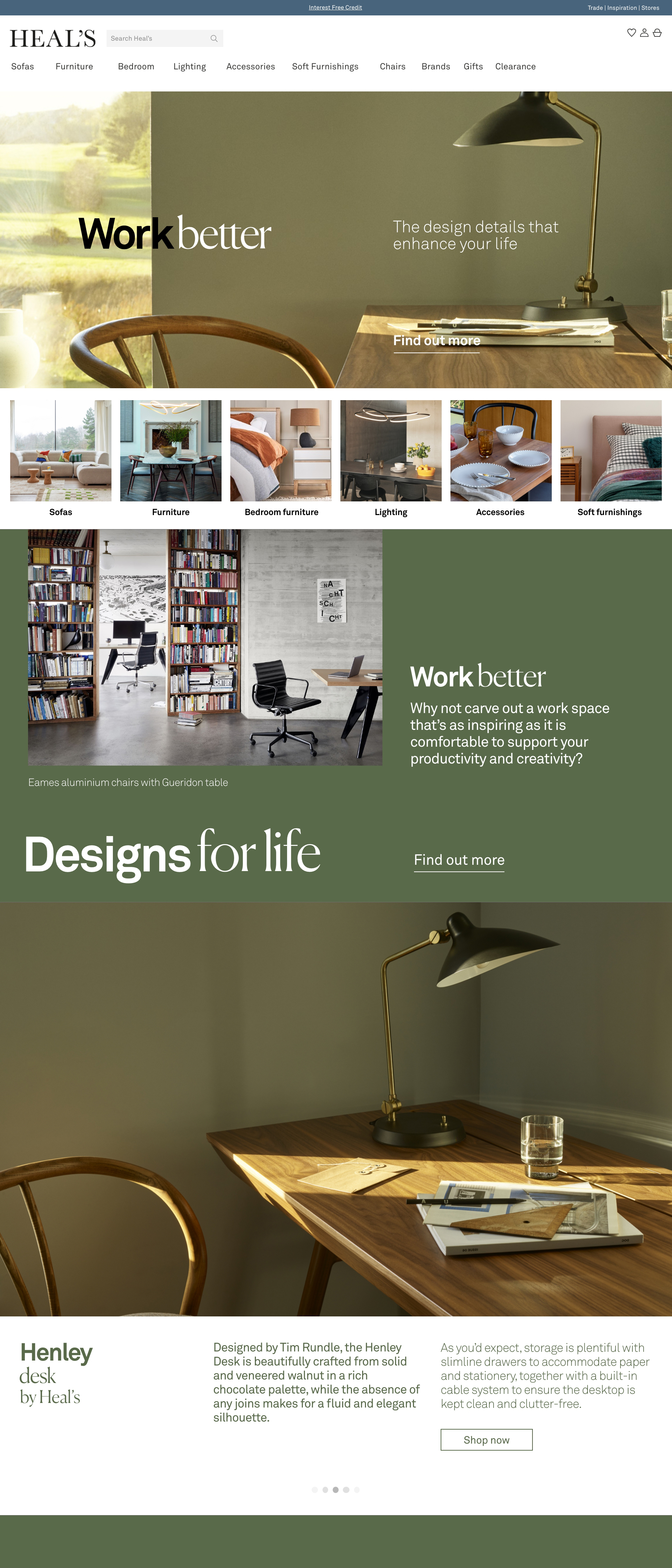
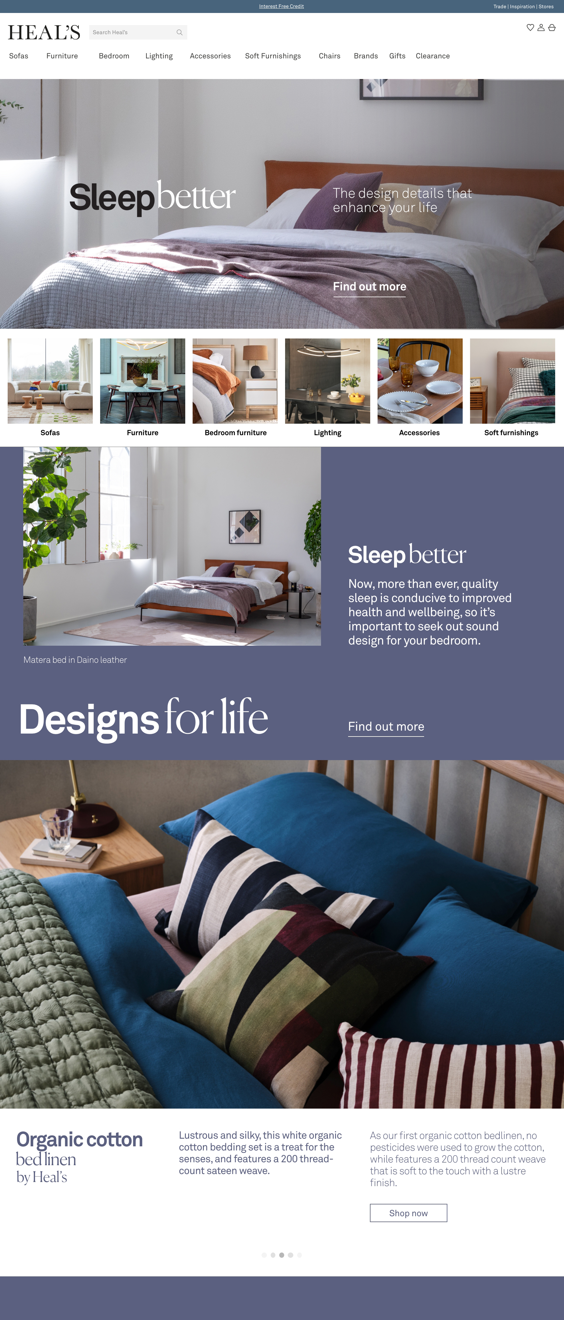
Heal’s Designs For Life
︎︎︎ In store design + website design
︎︎︎︎︎︎︎︎︎
︎
︎Client – Heal’s
︎Role – In-store / Website / Animation
Campaign design for Heal’s based on the dual concepts of wellness and longevity – entitled ‘Designs For Life’. A curation of products into six families – ‘sleep better’, ‘work better’, ‘illuminate better’, ‘relax better’, ‘dine better’ and ‘organise better’, that will be showcased each week of the campaign.
To simplify the project and avoid as much visual clutter as possible, I wanted to explore using animated type to slide between the campaign title it’s category name. The challenge was to get the type legible across the lifestyle imagery. So I employed some slightly more radical cropping to get the best result.
Brief - Daniel Boden-Wilson
Copywriter - Nicky Rampley-Clarke
Visual merchandising - Emma Qavi & Stephen Clough
Website animation - Rebecca Phipps
︎︎︎Heal’s Designs For Life webpage
︎︎︎Home page banners with animated lock-up
︎︎︎Website home pages


︎︎︎Store window decals